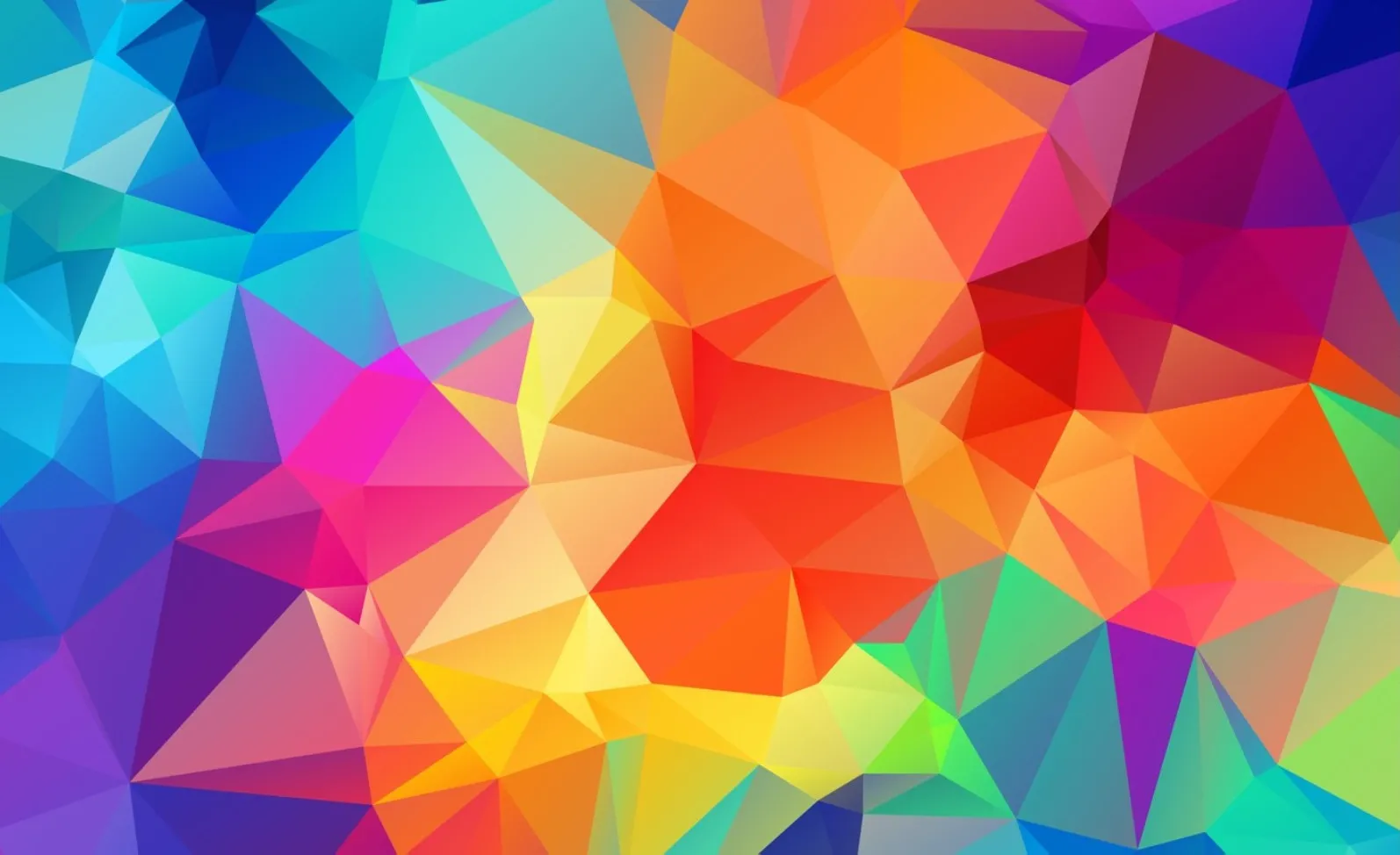
Coloring in the décor is always an adventure. Just as furniture has each one function, the colors in the decoration also have them. It all depends on how they are used! In addition, they give personality to the environments of the house.
A good print with a tonal mix can be the first step to transform a neutral room into boho oasis, for example. Or a clear tone on the bedroom walls may be exactly what you’ve sought to make the environment more relaxing.
Want to know how to change everything at home, and what is the meaning of each of the colors in the decoration? Keep reading!
How to use color in decoration?
What is the theory of colors in decoration and what is it for?
Color theory involves the study of shades and how to use them in harmony. It is useful in design because it informs a palette that works well together. These choices play a key role in the general environment of a home because color can influence mood, feelings, and even increase the amount of sleep you sleep.
We also highlight the secrets to combine colors with ease, without having to break your head too much!
Color theory is the artifice used by designers and artists to find those perfect combinations of their works. In short, it’s the mix of science and art in search of understanding what colors combine — and for what reasons it happens!
Don’t confuse color psychology, you see? While the theory explains how to combine, psychology shows by what reasons a color can be beneficial in a certain place of the house.
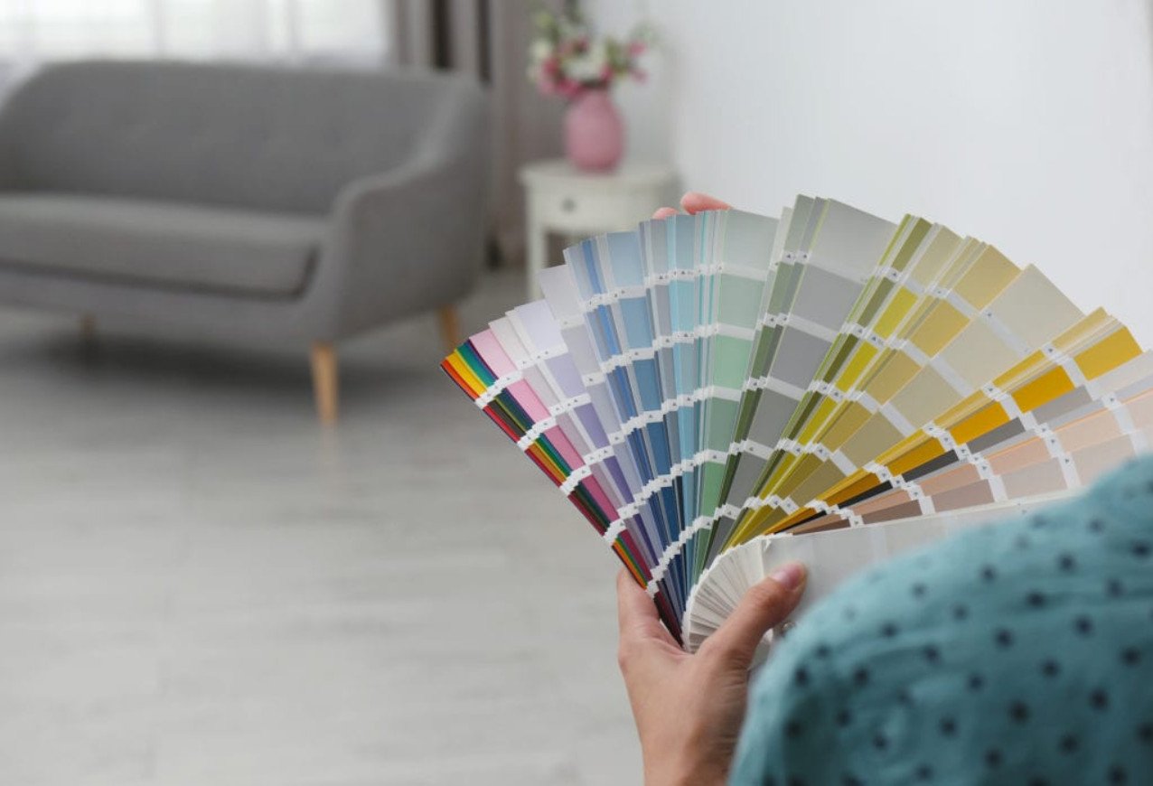
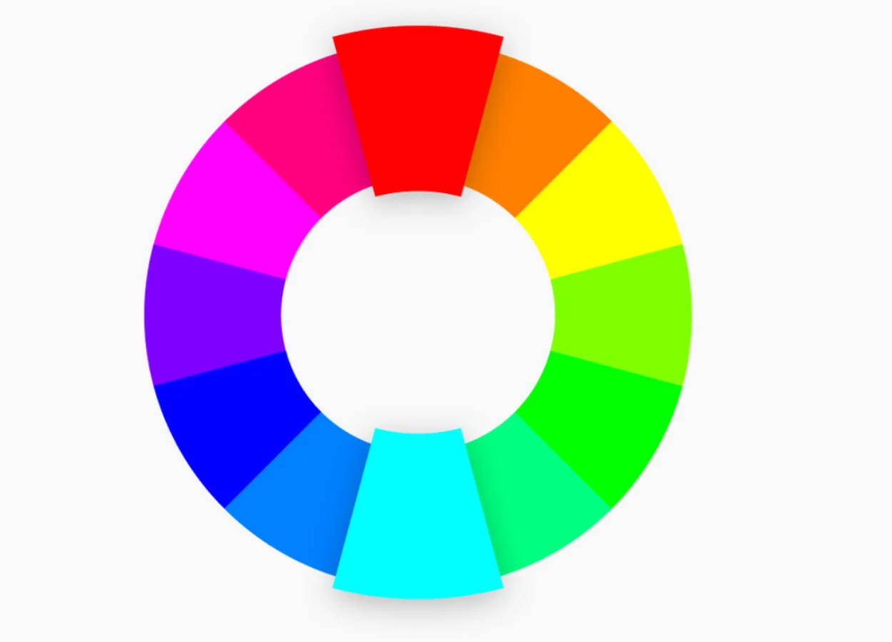
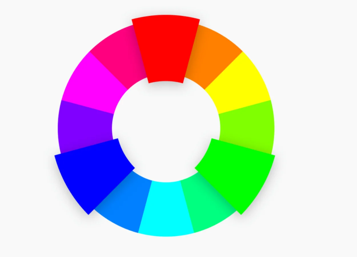
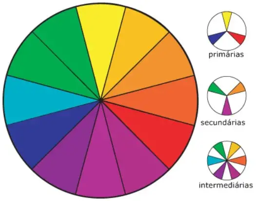
Find out the Chromatic Circle
The first time we hear about chromatic circle is with Isaac Newton. The same, best known for naming three essential laws of physics!
We have the record of this “invention” around 1666. At this time, Newton investigated the scattering of sunlight in rainbows using prisms and mirrors. He observed how a beam of white light falls on a prism and divides, on the other side, between red, orange, yellow, green, cyan, and blue. Then he studied combinations of those shades.
This is how he understood red, green and blue as primary colors, for example – noting that the combination of lights in these three shades resulted in white.
Then, mixing these primary colors, he found the ones we know today as secondary. They are cyan, magenta and yellow.
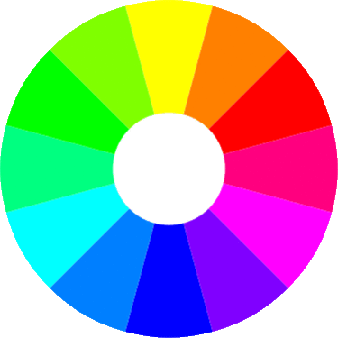
It was then that Newton mapped these tones in a circle, separated as slices of pizza. Currently we use the chromatic circle as the main reference of the types of harmonies that we create with colors!
When we combine colors and they do well together, we have what we call harmonic tones. Today, after much study, we also know several different types of harmonies. They follow certain rules, governed by the positions of the colors in the circle.
Monochrome harmony
Select a tone to use as the basis of your color chart. Then complete this palette with softer or more intense versions of that same tone. You have a monochrome harmony.
It is a subtle, versatile and practical combination! But if you’re going to wear it, make sure you really love that color. If not, you’ll get sick, see?


An analogous harmony
The analogous harmony is composed of three colors that are side by side in the chromatic circle. It is very easy to compose color palettes like this, since these shades are very close. However, depending on the choices, some balance in the decoration may be lacking. That’s where the neutral tones come in—hand them between your color palette to make it more balanced.
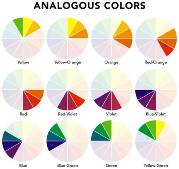
Another tip for using similar colors successfully is to choose only one as dominant. The rest will be present in the details of your environment.


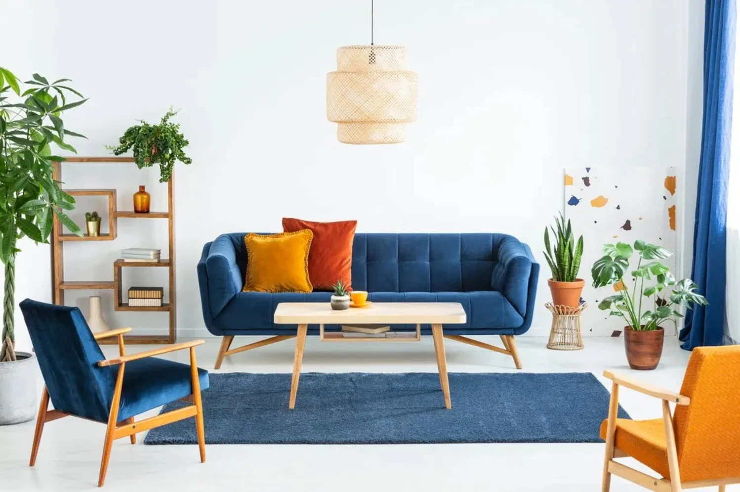
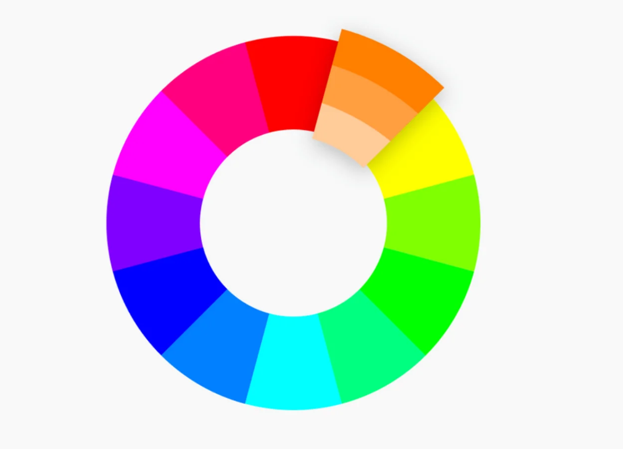
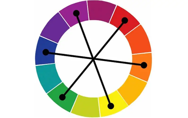
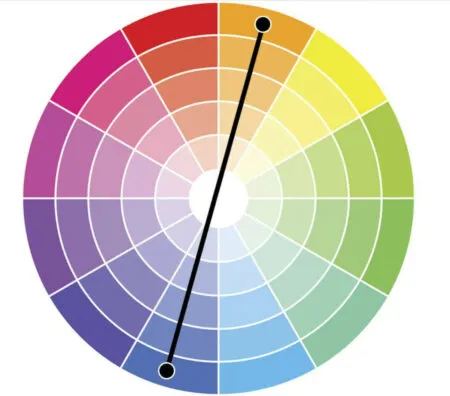
Complementary harmony
We say that a harmony is complementary when it is composed of colors on opposite sides of the circle. Generally, the impact and contrasts of this mixture are high!
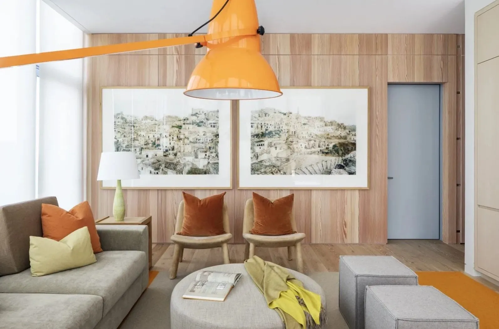
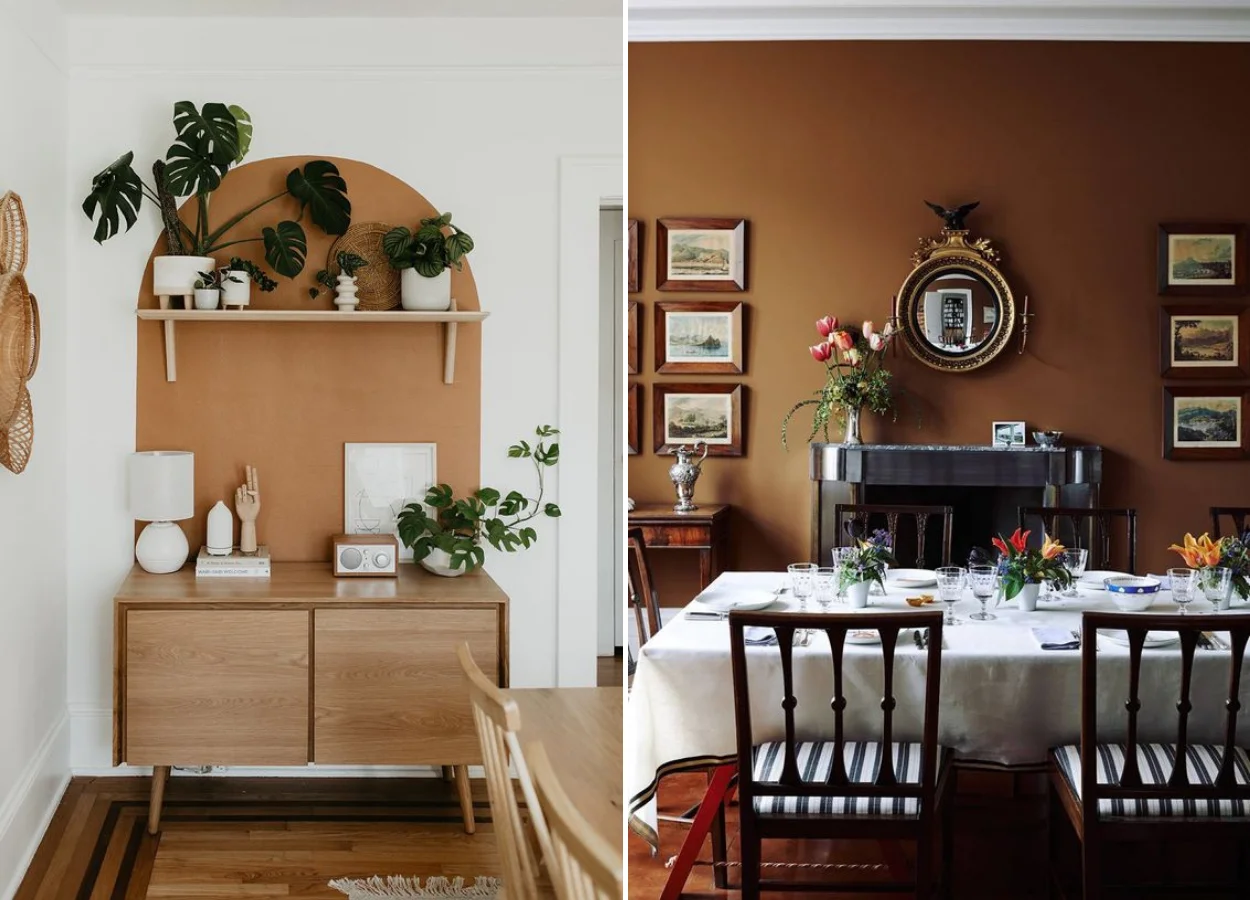
Smooth welcome tones with complementary warmth touch
The host is among the main trends in decoration for 2021. In the image of the room below, décor with cozy and complementary shades of gray light green and reddish touches to break a possible monotony, or a certain “hospital aspect”. Source: Decoration without a Doubt.


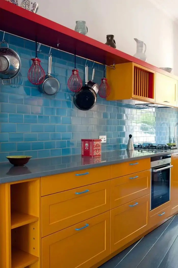
Examples of complementary colors: Blue and Orange. Photo by We Vans

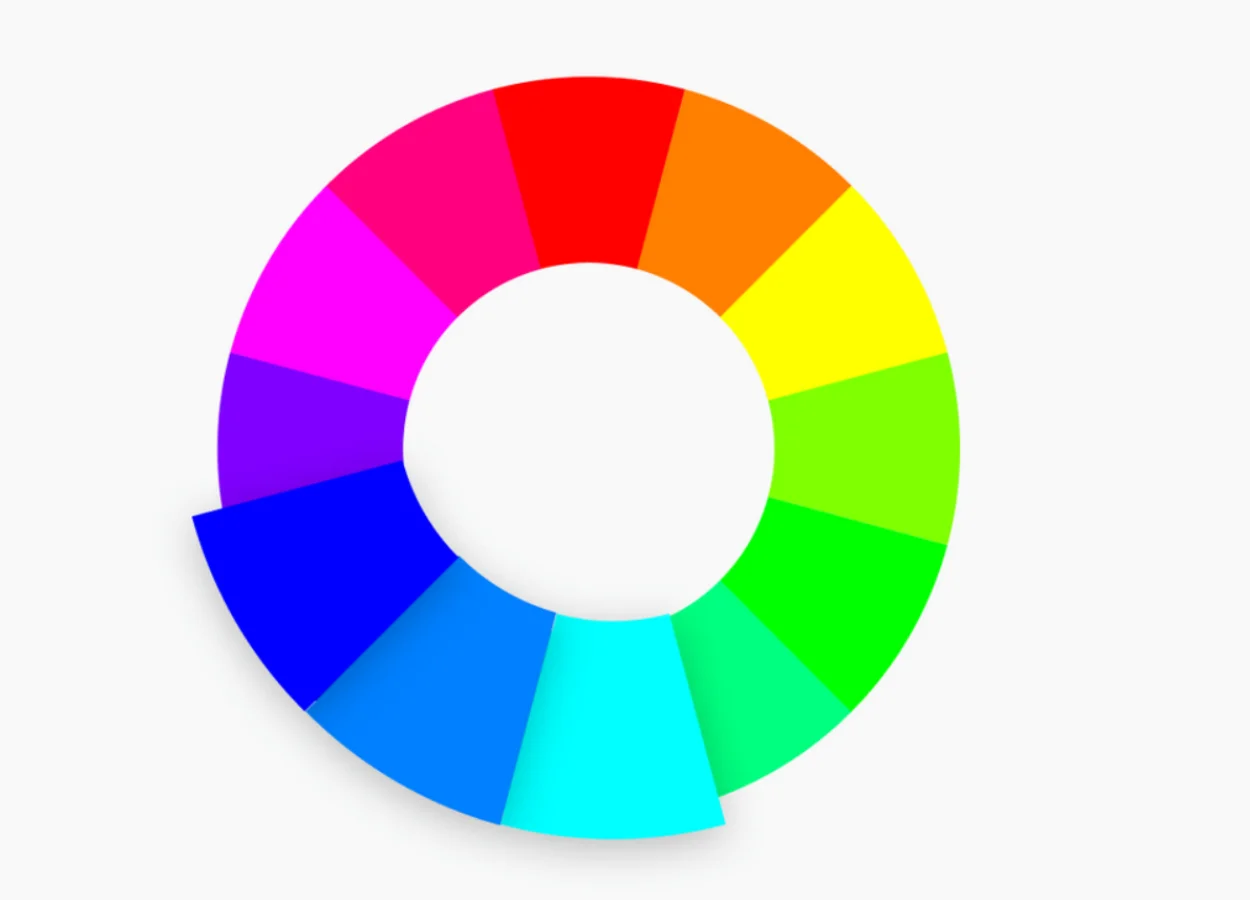
Triadic harmony
As the name implies, this harmony also involves three colors. However, this time they are also spaced in the color circle.
The result is, as in the complementary harmony, a very vibrant color palette and with intense contrasts. However, because we have three colors in the mix, we find the balance more easily.


The psychology of colors in decoration
While color theory involves more technique—and the observation of the chromatic circle—color psychology is based on sensations. It’s about how visual experience can also instigate our psychological responses!
Let’s take a simple example. When we think of this study of colors, we remember fast food restaurants. These places usually have a similar palette, anchored in one of the following shades: red, yellow or orange.
In addition to being present in the logos and promotional materials, there was a time when they always colored the walls of these places.
Today, we have already found these restaurants with more cozy and modern proposals of décor — following important market changes. However, the classic red walls are in memory.
Why did they do that? The answer is very simple: this type of tone is related to energy. Each in his own way. Red, particularly, is a warm color that motivates activity and in abundance is even able to generate anxiety. Therefore, it is a perfect tone to color the decoration of a space that needs high turnover of people!
The nuances of red are also widely used in liquidations precisely because they bring this sense of urgency. Today, this use is so common that we also relate very vibrant versions of the tone to something cheap. Interestingly, fast foods tend to take more information into account.
Nice to think about colors that way, right? Let us now discover the meanings of the other colors in the decoration and how to use them!


Red
It’s not just the upheaval that the red-loving-loving lives, you see? The meaning of this color has a lot to do with her story. In ancient Egypt, for example, it was related to celebration. But later in time, she appears in clothing and art as a sign of wealth.
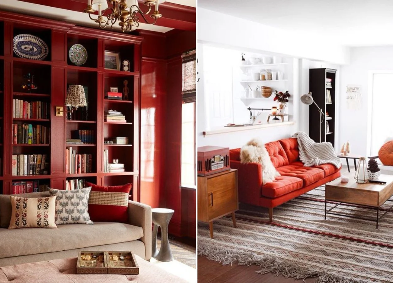
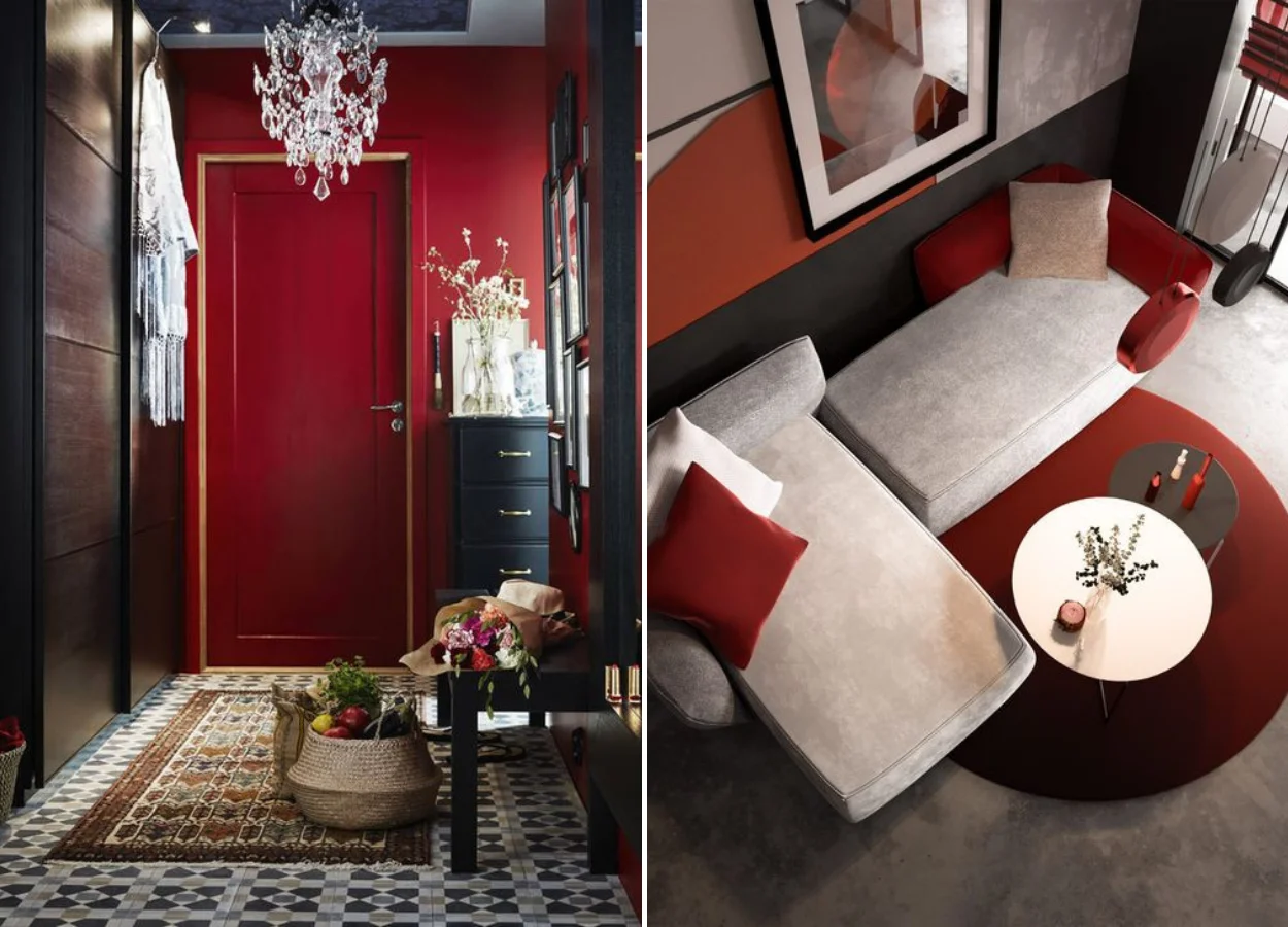
All this shows how we can interpret the nuances of red! Those darker fall well in classic environments, which ask for sophistication. How about making a red shelf, like the one below, in your room? The trick to make the environment tasty is to prefer a more closed or burnt tone, nothing vibrant.
Another way to use the highlighted red on the decor without regret is to choose a key element of the coloring environment. The rest remains neutral. That’s what happens below, in the case of the couch!
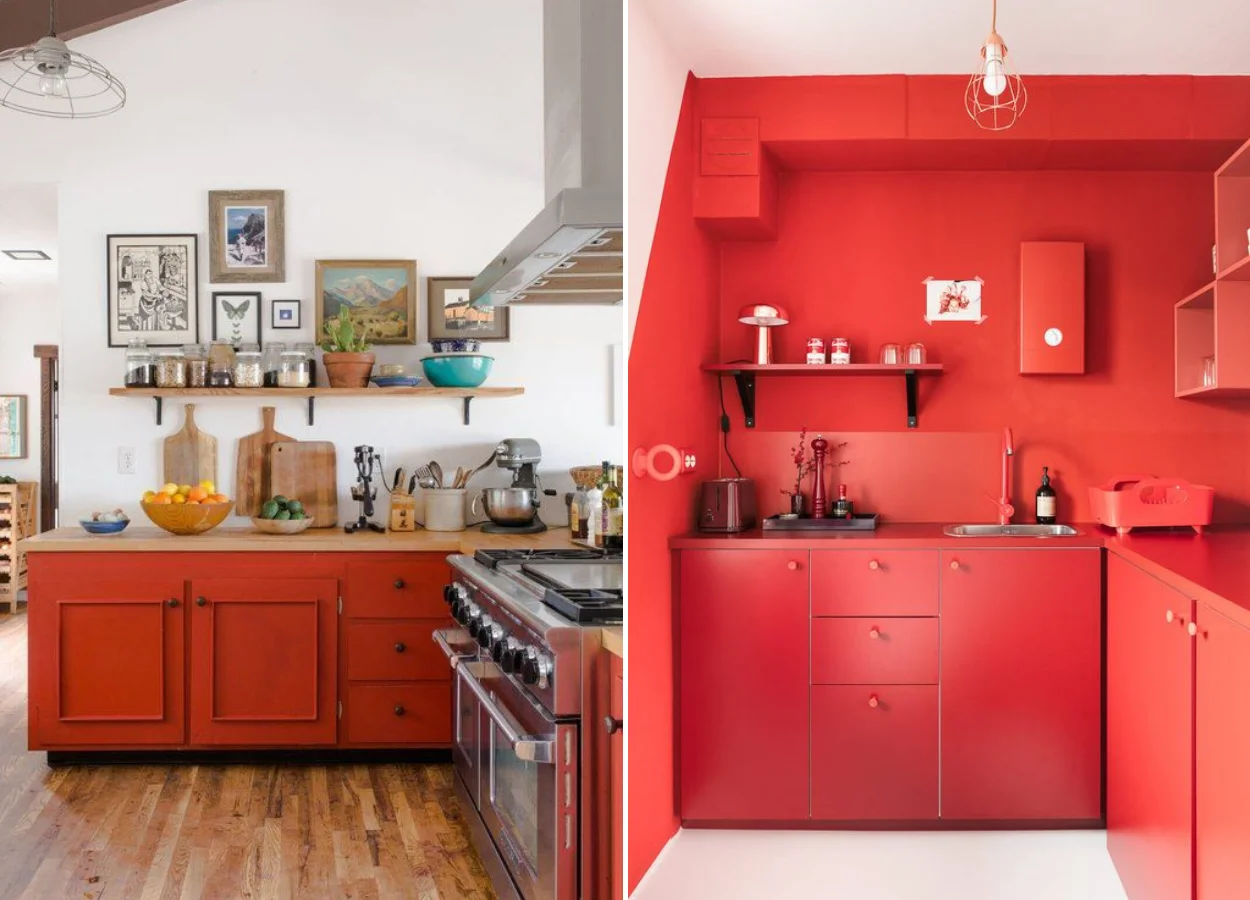
And if red is so present in fast food restaurants, it is because it is also linked to increased appetite. Therefore, it can also be one of the colors in the decor of our kitchen, right? The result — whether it’s in the closet or on the walls — is usually a very modern environment.
And speaking of modern… the bathrooms with the color are also like that! To have at home, bet on the painted cabinets or on fun wallpapers in your toilet.
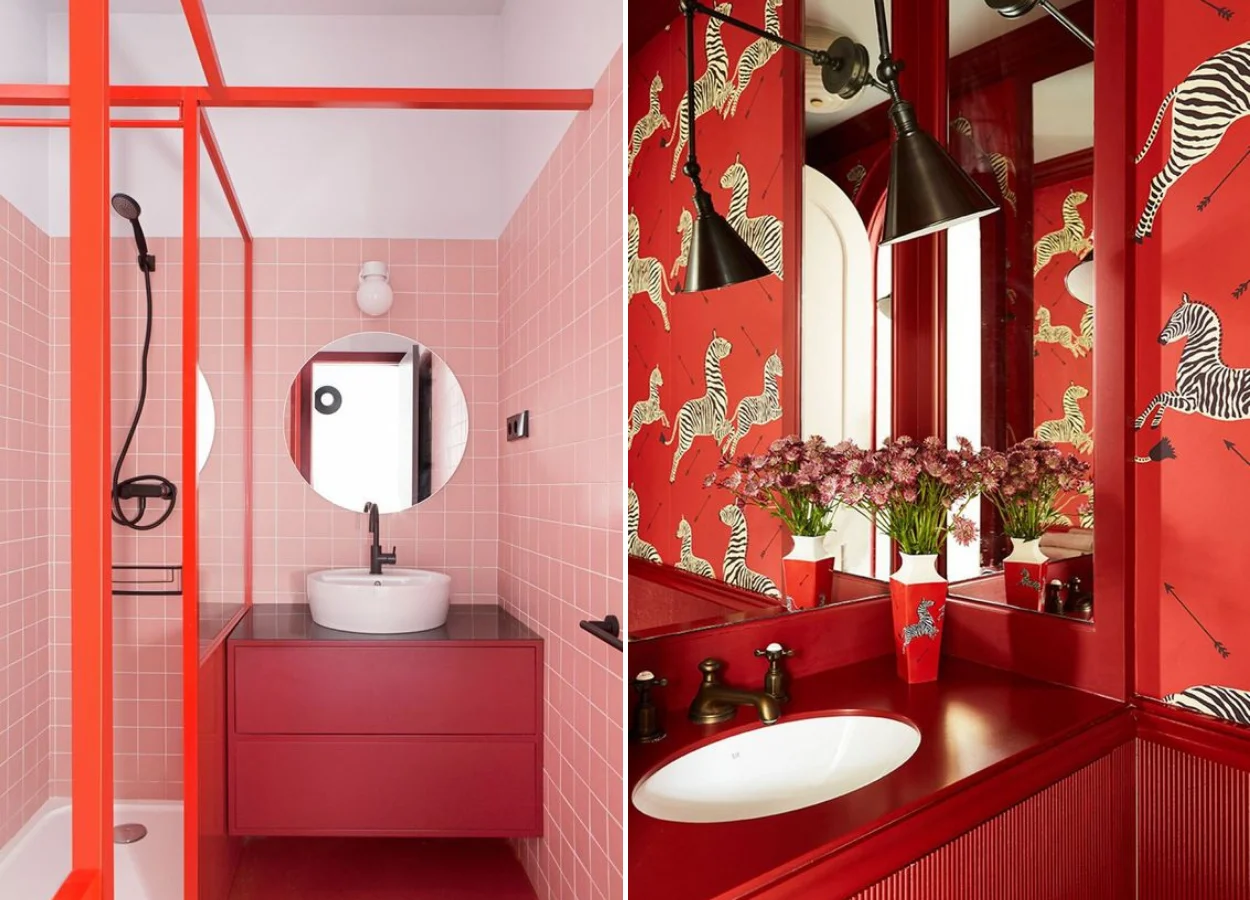
One more tip: when decorating, think about using the nuances of red to highlight some details of the house. The gateway, for example! After all, the first impression is the one that counts — and with the tone, you’re sure to make an impact.
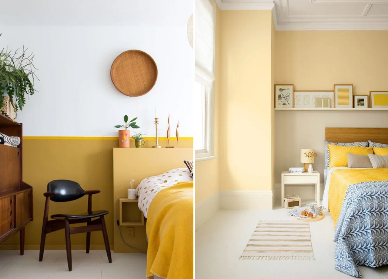
Yellow
Oh, what a joy! This is the feeling most commonly related to yellow. The color in the decoration brings optimism, inspiration and a little bit of heat — a reference to the pleasant sun of summer.
Try using it in the environments of the house where you most welcome friends and family. For most people, the living room fulfills this function.
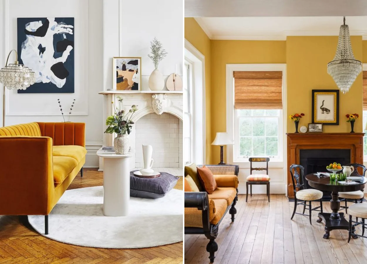
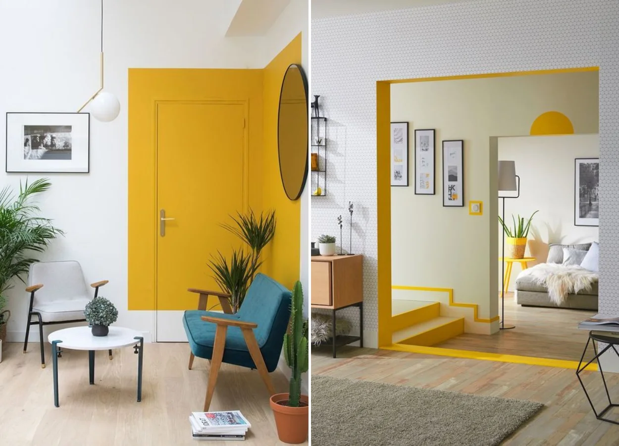
But you don’t have to bet all your chips on the yellow and paint all the walls in the tone, see? As it is connected to creativity, take advantage of it to apply it in the décor.
Try to paint only half a wall of yellow. Or, go further and paint a geometric figure, such as a rectangle, delimiting a part of your décor!
In the second photo, we brought another incredible option: coloring the span of the portals, when the house has environments connected in this way. The mirrors of the stairs and trims of the environments also lead to color.
For the bedroom, you can opt for shades of yellow a little lighter. Mustard appears a lot in these environments, as does pastel. The combinations are the warm neutrals, like those of natural materials, and also quite white — which helps to balance the color vibration!
Pastel tones, incidentally, are trendy in fashion. Did you know that? Some of the tips to have them in your closet can also help you in the mission of coloring the décor. Check out our subject matter!
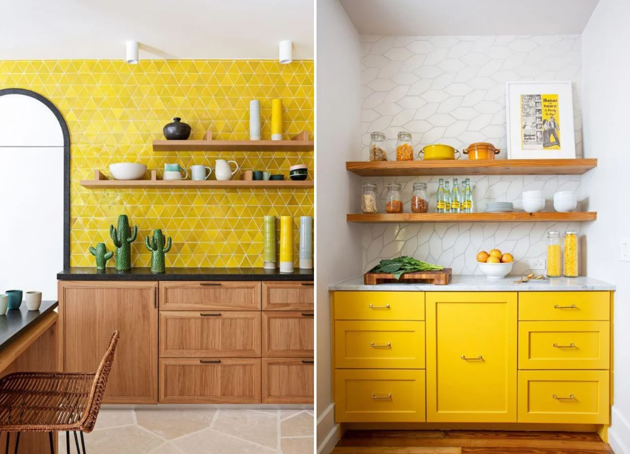
In the kitchen, yellow is present in the tiles. When it ends up in the cabinets of this room, it is combined with quite white — and marble countertops or light granite.
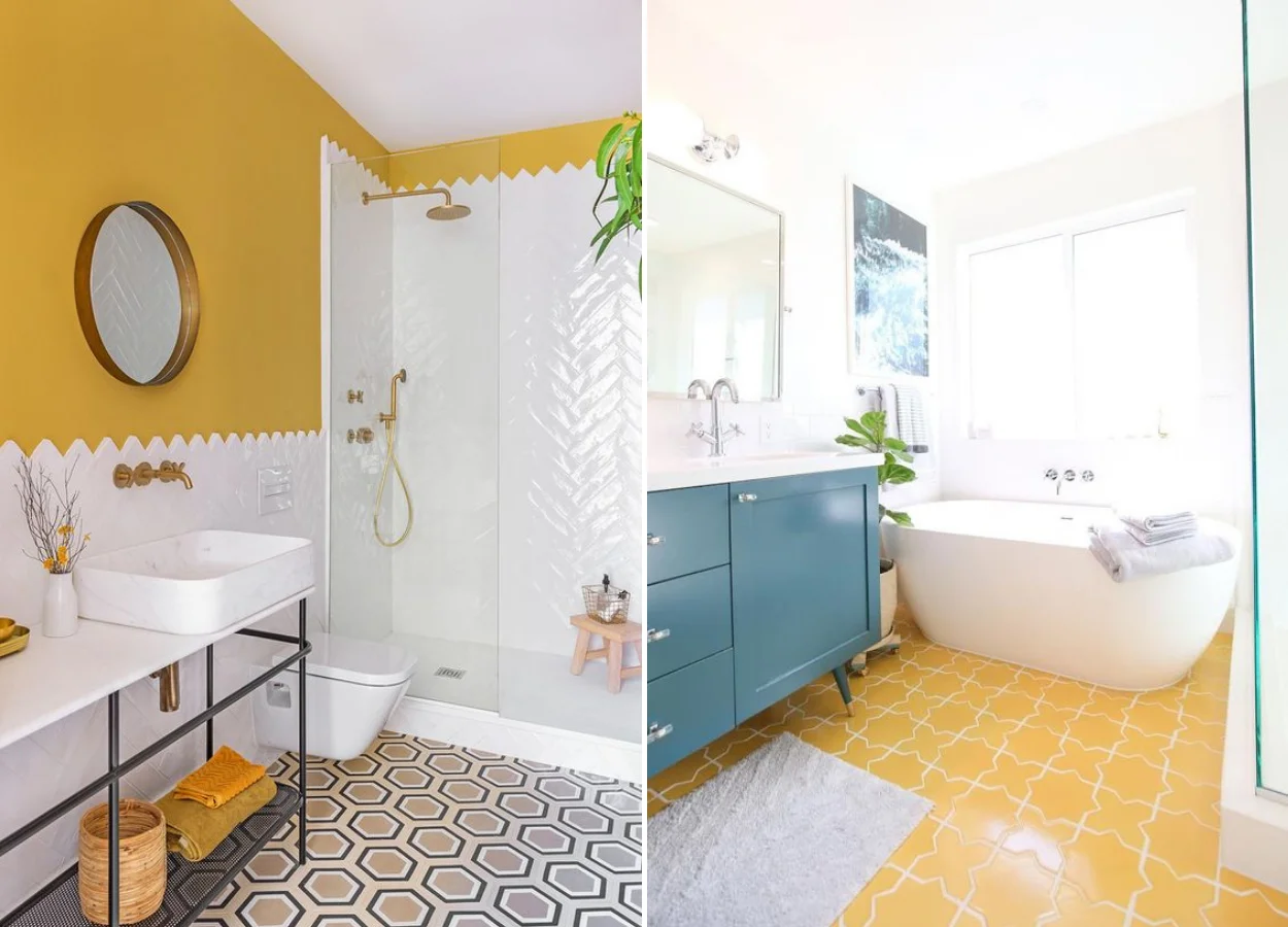
You can also give joy to your bathrooms using yellow. You can bet on the walls or even the floor. Blue is a good counterpoint a little colder for such a warm color. Try it!
Orange
The most vibrant shades of the color chart have some similar meanings. Like yellow and red, orange is full of vitality. It represents the enthusiasm of youth and the freshness of the citrus fruit of the same name.
All this culminates in the relationship of orange with energy and, why not, physical activities. Therefore, the color is a good request for toy libraries, gyms, or environments that ask for something more fun and jovial. Inside the house, he almost always appears in very contemporary and creative contexts.
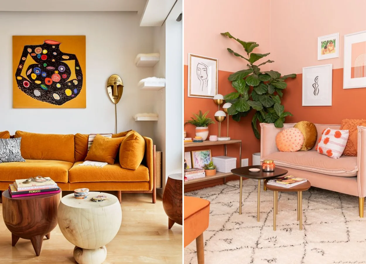
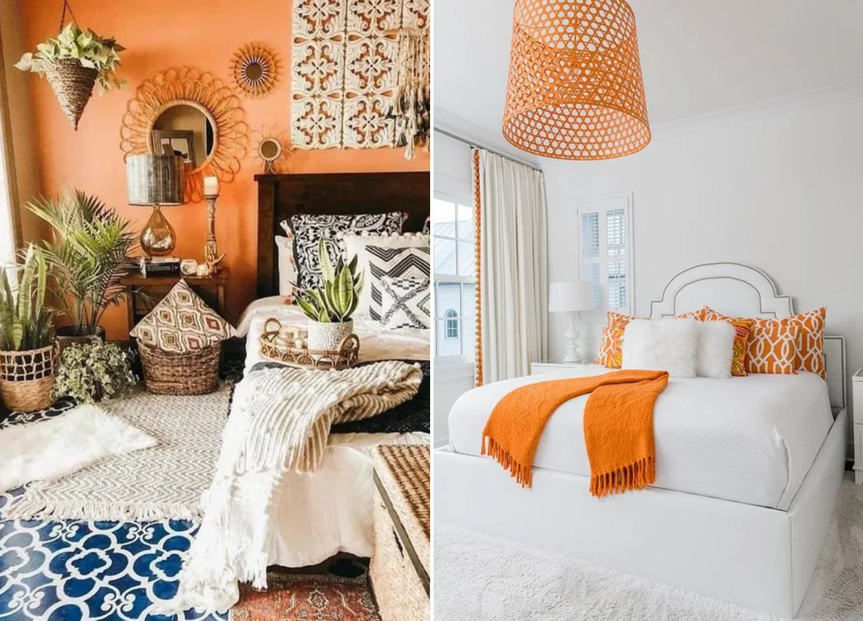
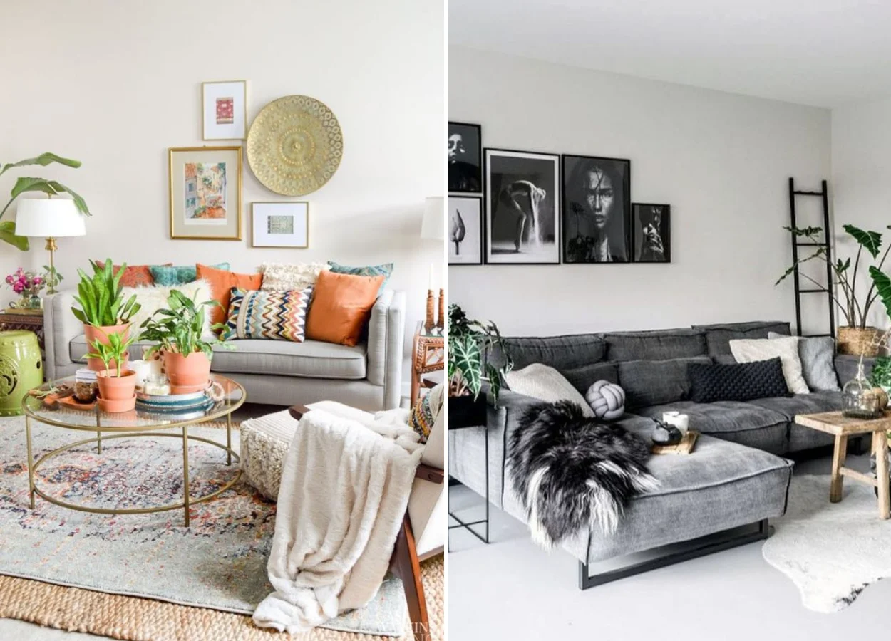
And do not think that orange, because it is such an active color, does not appear in the room! The boho décor, full of neutral tones and textures, takes advantage of the orange to bring shine to the environments of the house.
At the same time, it is also widely used in the details. Textiles, such as cushions and curtain, bring an opportunity to use orange in these spaces.
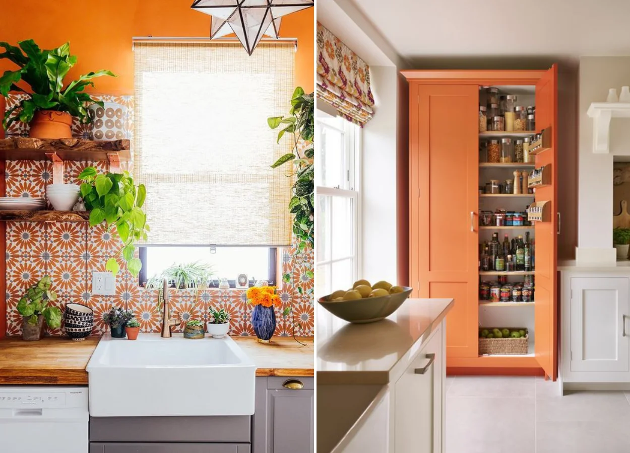
You may have guessed now: orange stimulates appetite, just like red. So you can use it in a cool kitchen! Bet on tiles, ceramic vases and even a pantry in color.
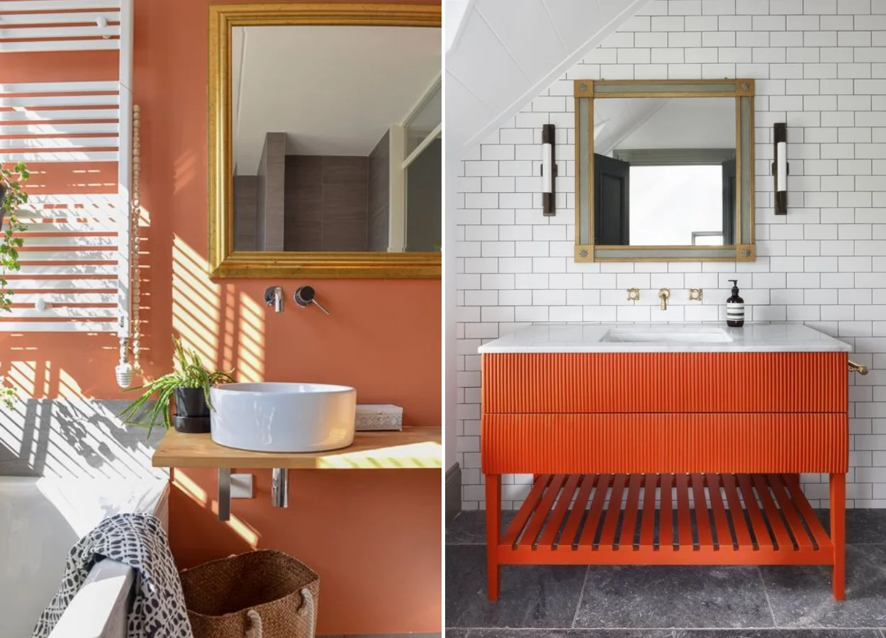
We’ve reached the bathrooms. In this relaxing environment the nuances closer to salmon and peach are more common. However, those who love orange do not miss the opportunity to take advantage of it very brilliant in a cabinet.
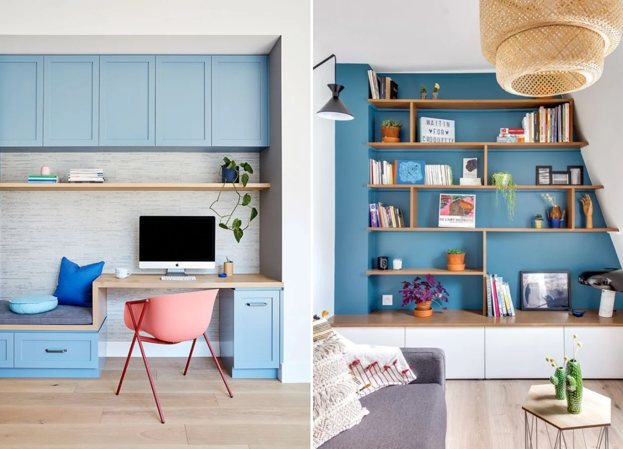
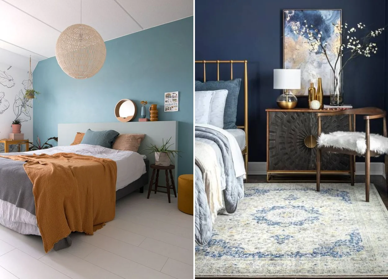
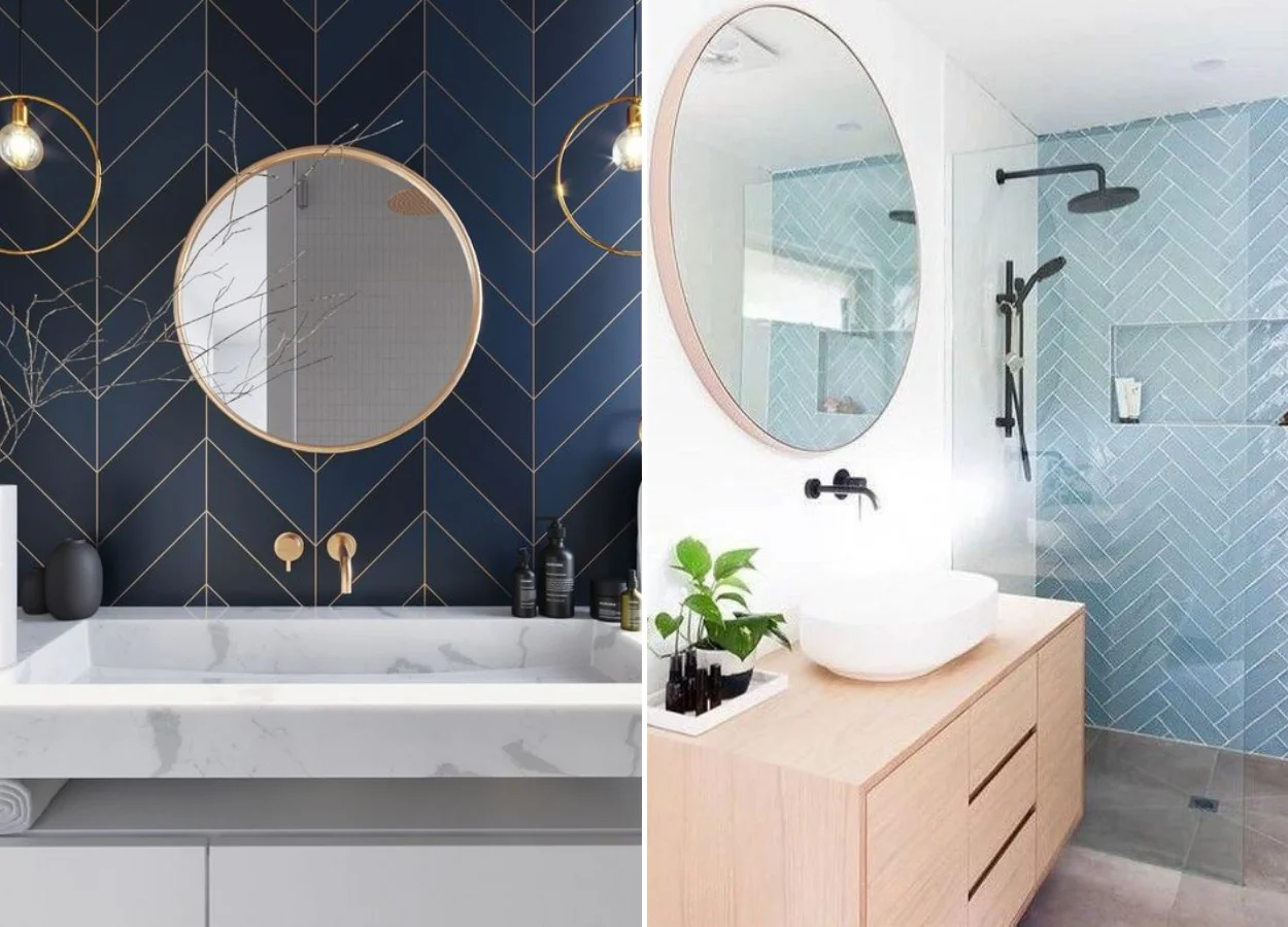
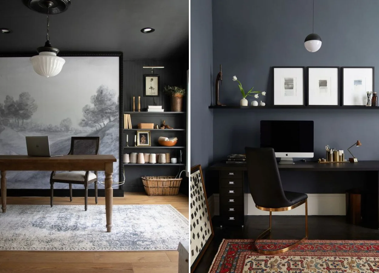
Blue
Thinking of decorating the office? If you like a more modern decor, try wearing a dark blue! While the vibrant colors above are linked to anxiety, it is a calm tone and also focus. It can decorate more relaxed rooms, such as the living room, but it is more common to see the color in these spaces that inspire wisdom.
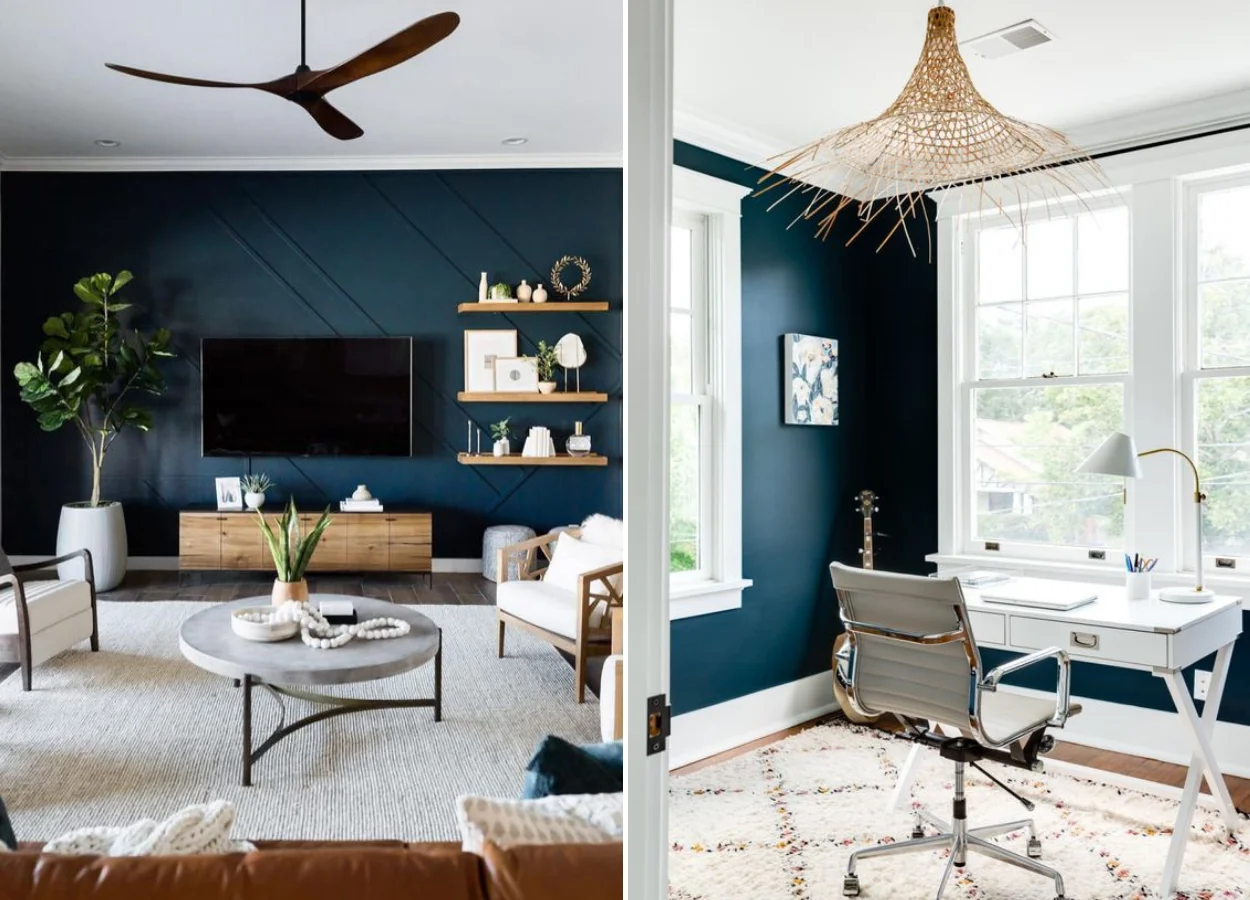
Love blue, but want to avoid the colors in the decoration of your house from being too dark or bring a more healthy air? Change the tone! Add a little white to this ink and enjoy the blue light. It brings a nice atmosphere to any space.
You can do this in the relaxing corners too, see? The nuances of blue fall very well in rooms. Both adults and children!
Combine with a little orange to bring joviality. Already with dark and golden wood, the result is very sophisticated.
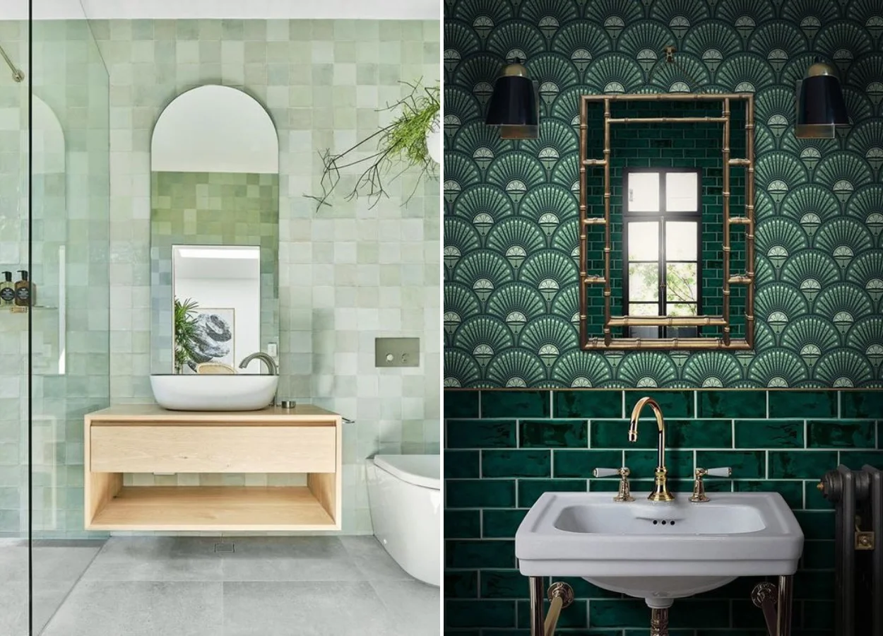
In bathrooms, the blue usually decorates the walls. Tip: Use a different coating, such as the subway tiles, in a chevron-type pagination. It is she who stands out in the photos below!
Green
Green is one of the easiest colors to bring indoors. This is because it does not depend on the paints of walls or decorative objects. It is the tone of nature – and every well-thought-out environment benefits from some plants.
- Then see all about Decoration with Plants – Urban Jungle is trending. Learn how to choose and take care of plants at home. And also Garden of Juicy: discover types and 47 photos of inspiration, because succulents are a trend in decoration and serve to give life to any environment.
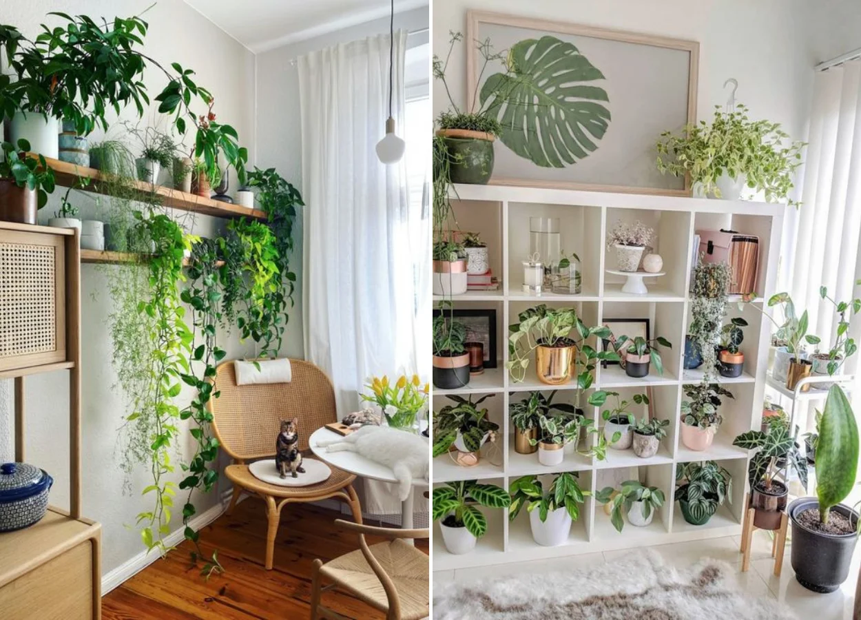
Color, like everything that is natural, is full of life and represents growth. This is an ideal mood for a room!
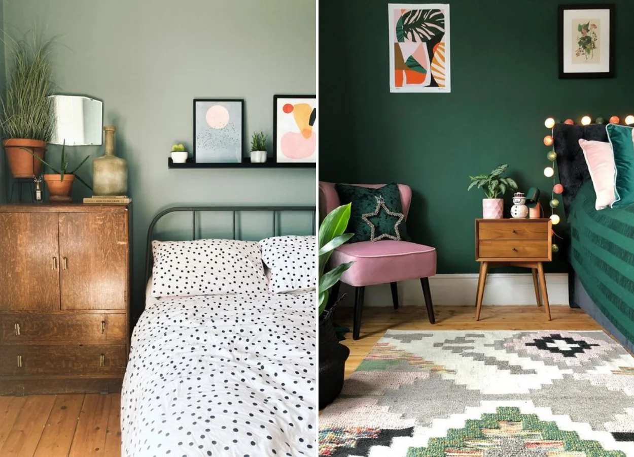
Do you know another space full of life? The kitchen. We play a lot that she is the heart of the house – an essential part of our routine and also of the special moments we live with friends and family. It is worth painting it of that color.
In addition to the above meanings, green can represent one more thing. In a way even a paradox: it is related to money. Because it refers to prestige and possessions, the dark shades of green also do well in offices, for example.
See how different and versatile is it? Therefore, the tip is: use in all environments that need a push in these directions!
Purple
This is the nuance of royalty: when we see the purple in the decor, we relate it to precious stones as the amethyst. A deep purple, jewel-like, is perfect for the fabric of the sofa in a contemporary living room!
The tone also stimulates the imagination. Because of this, it is quite common to see it in environments full of paintings and other colors in the decoration – especially those of other stones such as emerald green.
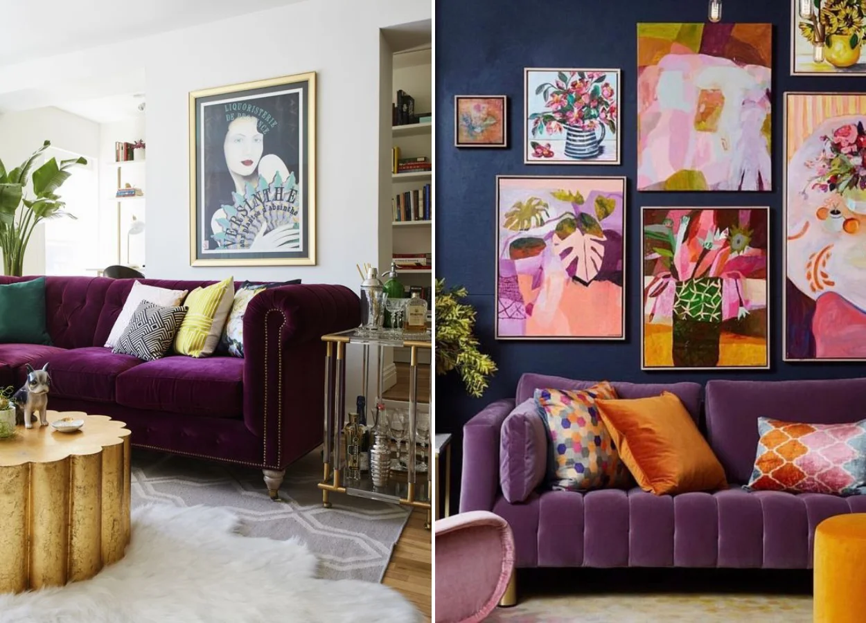
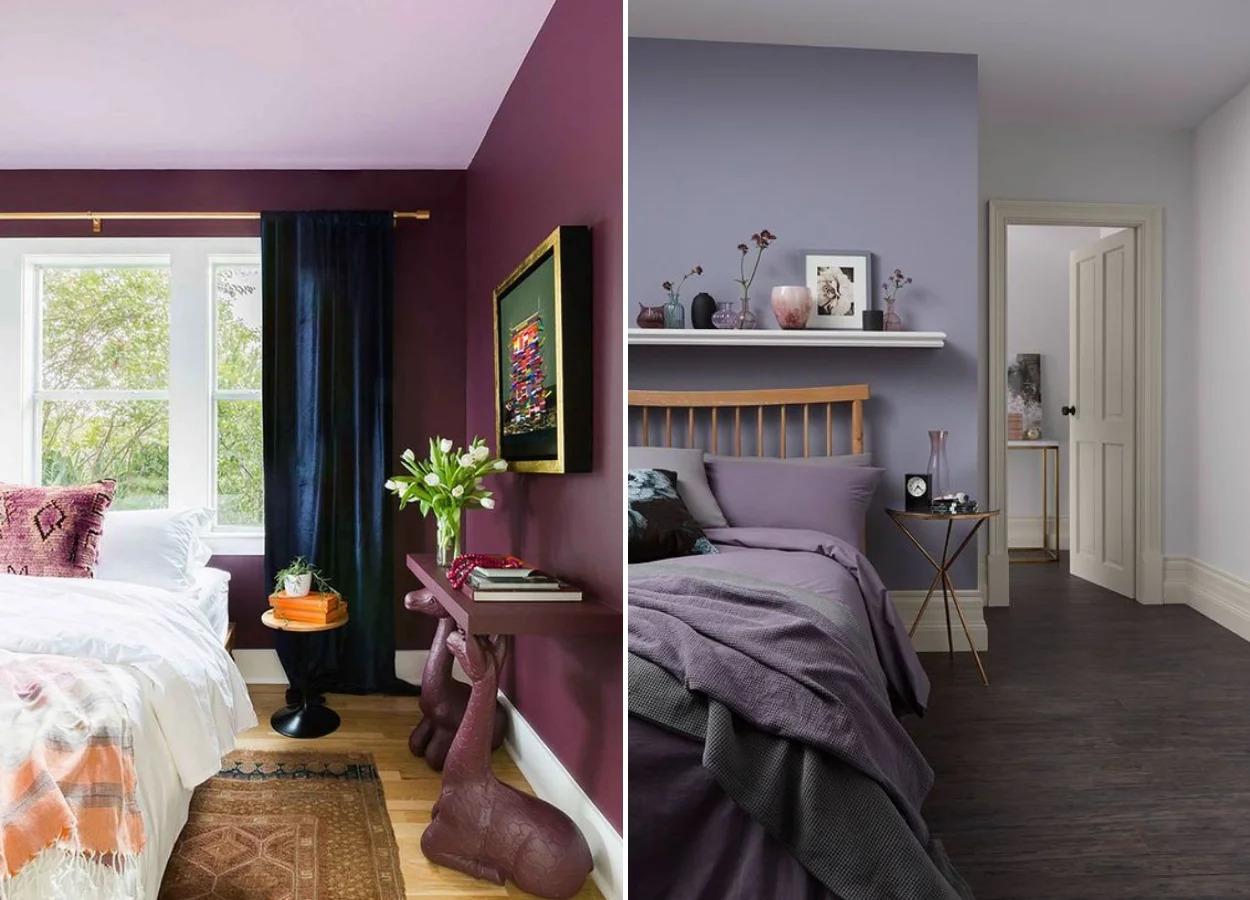
In interior design, purple is widely used in search of sophistication. Even in the rooms!
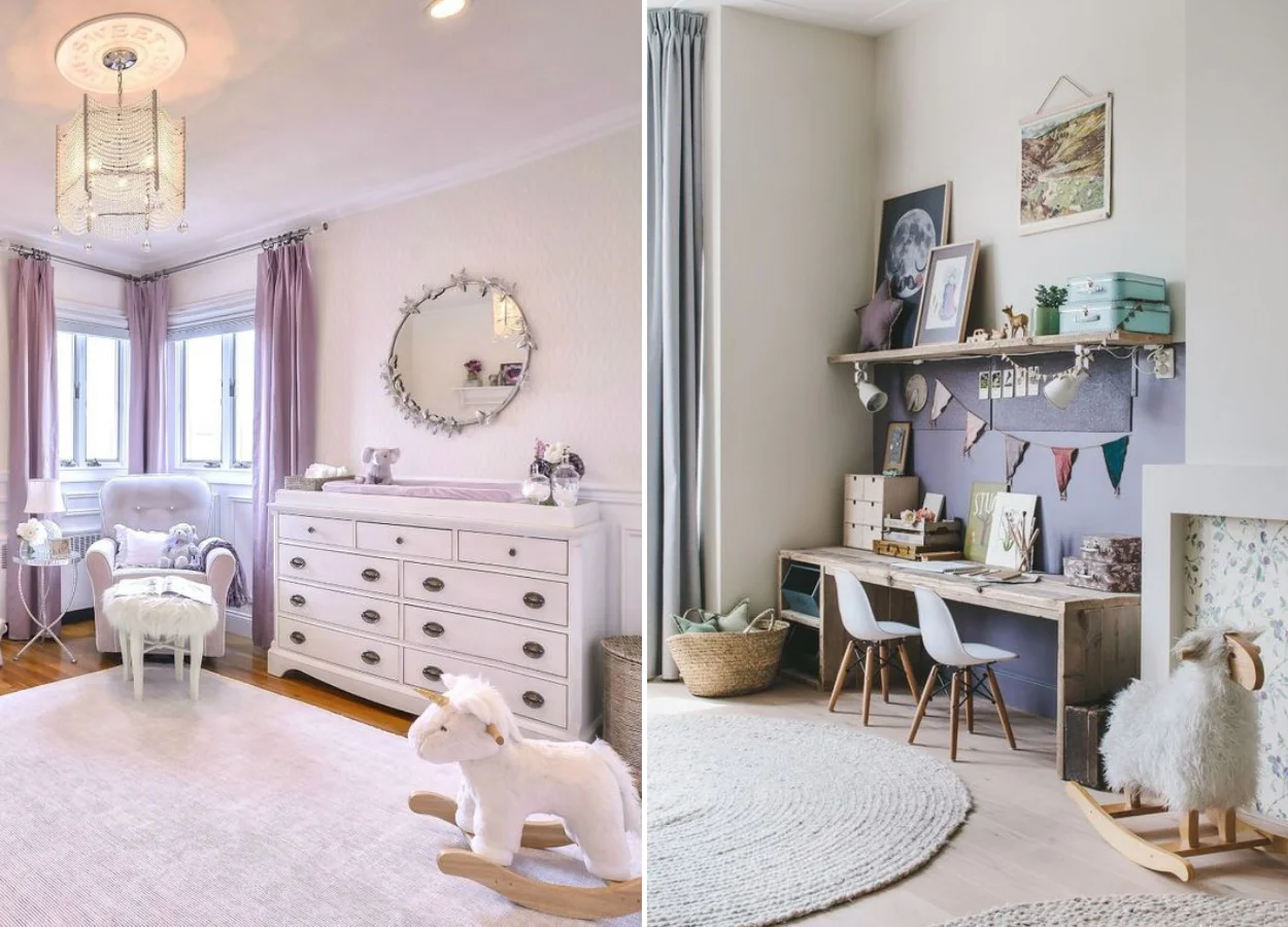
Lilac, incidentally, is very present in these environments. It is one of the colors in the decor of the most popular children’s rooms, for example. And do you have a better time than childhood to live surrounded by a color that stimulates the imagination?
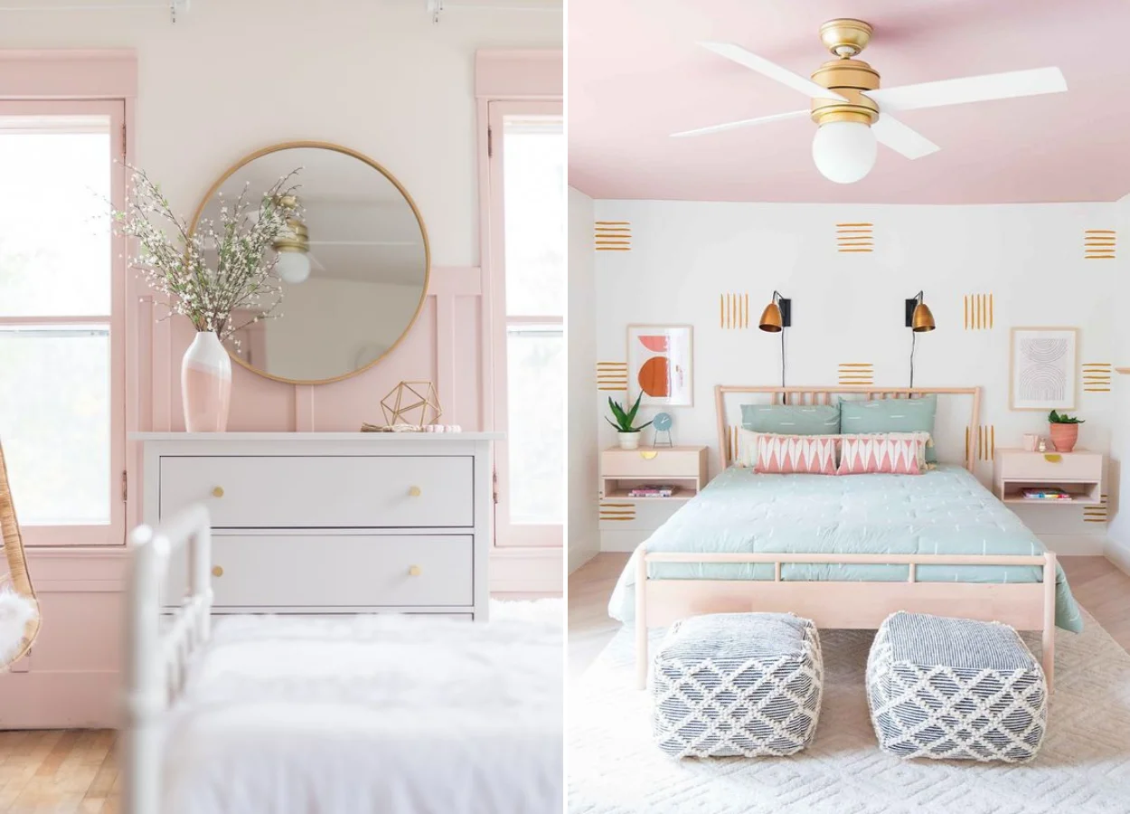
Pink
Romantic, sensitive, light and feminine. That’s how pink is seen! With that color, there is no secret. Its clear and sweet versions can be used according to your preference, when you want to bring delicacy to the décor.
It is the light and soft pink that is most often used in rooms. But, we know, sometimes it makes you want to do something different even with something so delicate. Therefore, we see a lot of color painting only half of the wall, which already has another effect on the decoration. She can also color her ceiling, have you thought?
As a combination, throw the golden hand in the mirrors, fixtures and decorative accessories. In addition to white, blue and also the sweet shades are great partners of the pink.
Strong roses like pinks bring a unique intensity. They are more jovial and electric. Did you know that even pink-shock is used a lot by the punk community? It is subverted as a sign of rebellion, mostly combined with blue and purple.
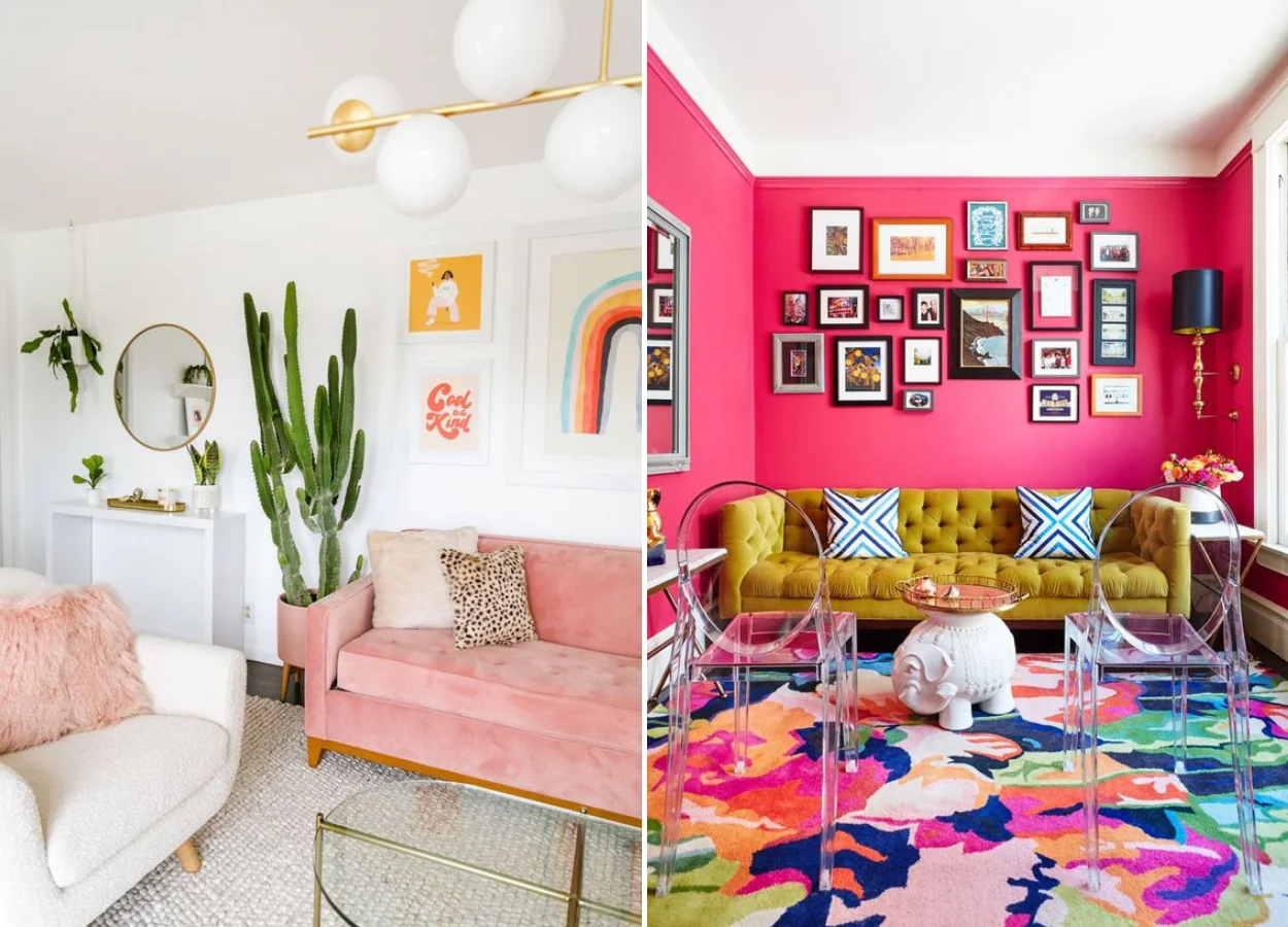
It has already been able to see that when we decorate with pink, we can follow two very different paths: one more classic and timeless, and another bold and inventive.
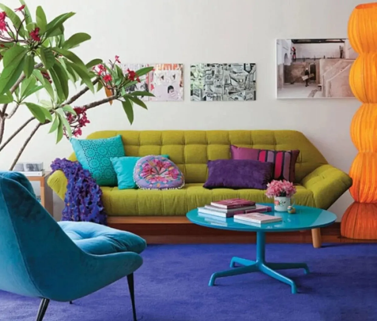
If you want to follow for this second, a very useful decor trick is to start the environment by a carpet. Take the well-colored room of the photo above as an example: full of pink, the textile also brings blue, green and orange. From it, residents and architects were able to pull other similar colors to the rest of the environment, combining them more easily.
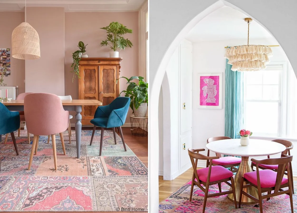
The dining rooms above are also good examples of this trick! The pink appears on the carpets next to a little blue, color used in other details of the decoration.
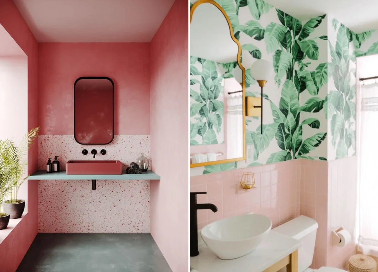
Pink is also a fun option to decorate your bathroom. Get inspired!
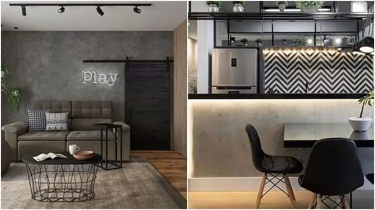
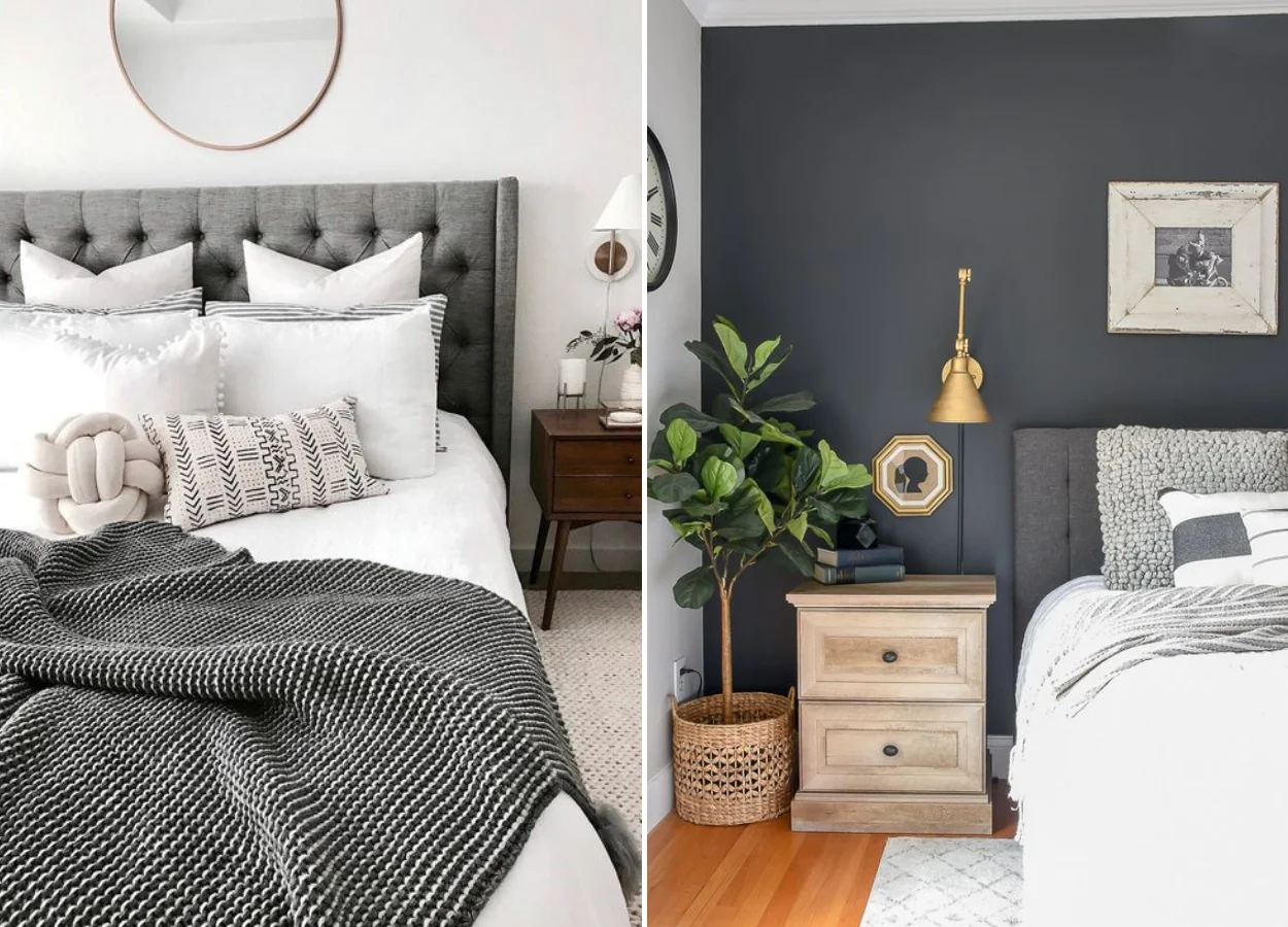
Black
Black walks side by side with purple in its meanings. It reflects elegance and mystery when used in an environment. Therefore, we suggest color in a more modern and daring room, for example. To make the space warmer, just bet on the brown together!
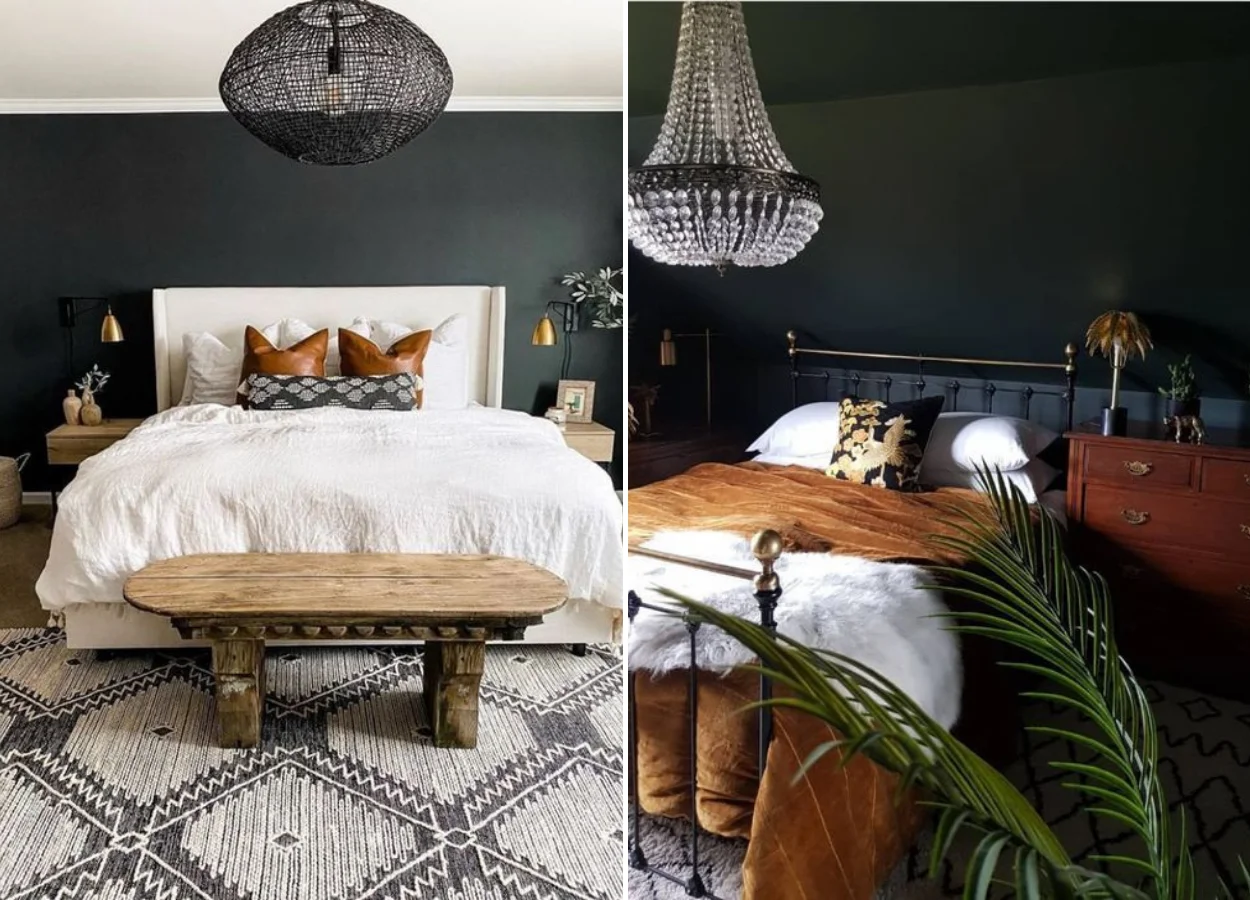
Most people are afraid of decorating with black. It is common, after all, to think that color will leave the rooms of the house heavy. Another popular assumption is that it does not look good in small houses or apartments, because it leaves the environments with a smaller appearance.
For these reasons, it is much easier to find decorative accessories in black than large elements of color. But we guarantee: a black wall here and there can have an incredible effect! When we use colors like this in the decoration, we guarantee a dramatic effect that makes a difference.
In addition, there are some elements that help you not “weigh” on the decor. Look for balance with other neutral tones and very light woods, okay? Light fixtures and mirrors are also great allies.
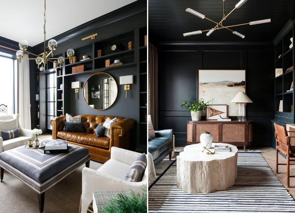
Thinking of coloring your black office? Go ahead! Go ahead! Enjoy and create contrasts with lighter frames and carpets. The result will be elegant, for sure.
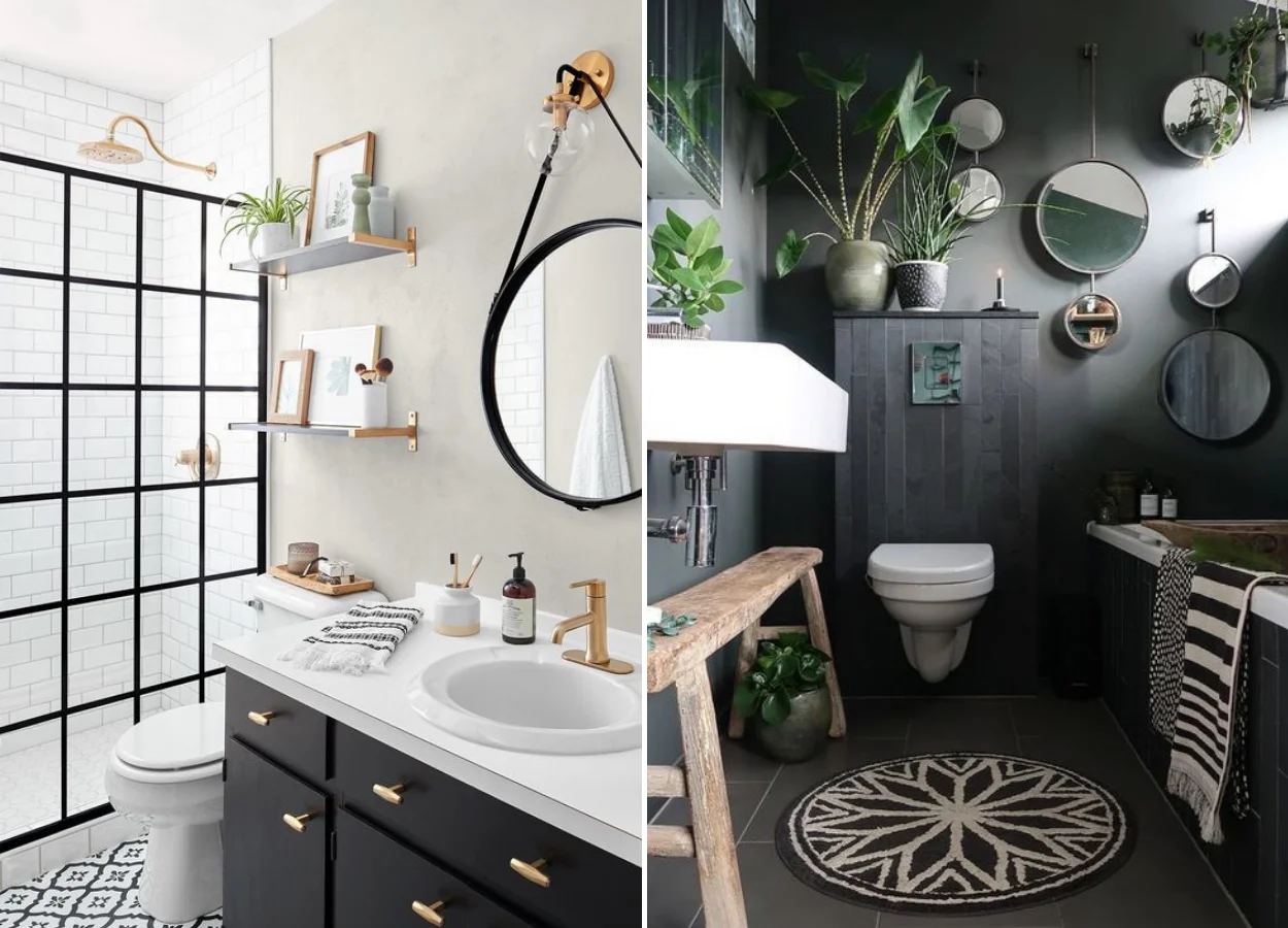
You can follow some different inspirations for bathrooms decorated in black. One of them is to use the color in the mirrors and in the details of the box, in a more secondary way.
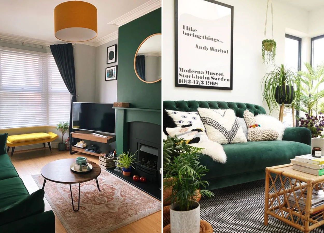
The other is to bet on the abundance of tone. To break the seriousness — and bring the calm that we love so much — splash the green environment with potted plants.
White
This is the most common color of our homes. It is the one we use on all walls, or to balance the effect of accent walls (or walls highlighted). This is because white as paint is extremely light and allows you to build the decoration around with a lot of freedom – the expression “white can be stopped” does not exist for nothing.

If you want an extra touch of personality, you can bet on warmer versions of it, such as the off-white. We talked a lot about them in our matter about neutral tones in decoration!
Remember: in excess, white can result in cold rooms. To combat this effect, throw textures. Marble, wood and golden metals or rose go very well here!
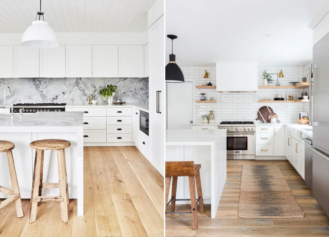
In fact, white is the darling of minimalist decoration. She uses these textures and details to reach a clean but still cozy décor.
Brown
We talk a lot about brown in architecture and interior design. This is because it is the color of wood – one of our raw materials from the browns!
We use a lot of wood when we want to bring natural textures to an environment. Along with it, there is always another good dose of comfort. When it is prevalent in an environment, the decor usually has a more rustic and warm atmosphere.
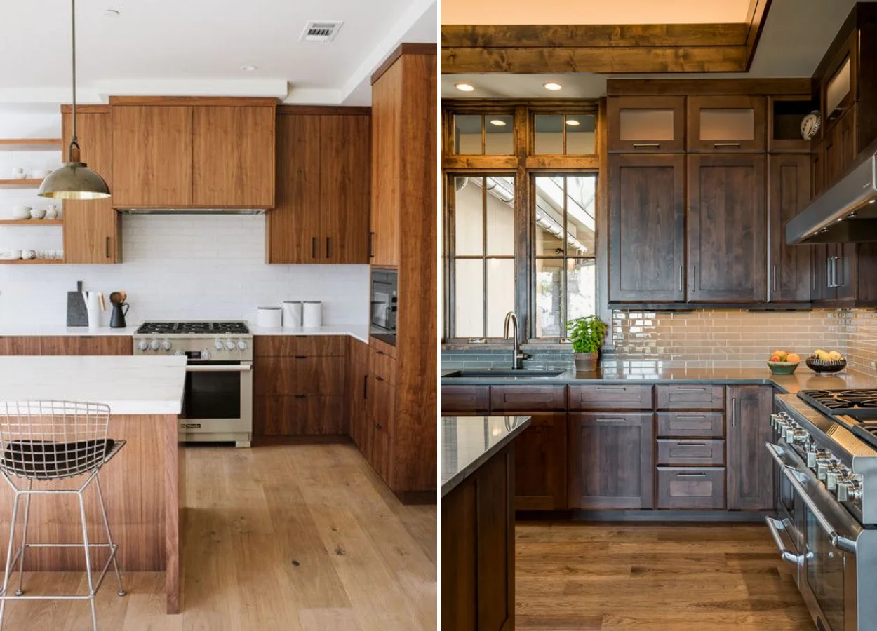
You can bet on brown in addition to wood. Paints and fabrics can also bring this effect of warmth and safety, okay? Invest on the walls or on sofas and armchairs of leather, suede and other textiles of the genre!
Learn more: the trend color of next year in the decoration is called Esculpida Stone, and resembles a mixture of brown and gray. Two perfect neutrals in the house decor!
Grey
Among the colors in the decoration, want to find a more elegant than the gray? It’s hard, huh! The tone is high as it is neutral, practical and can be used in various ways. One of them is through the texture of burnt cement from the walls, a creative effect that brings bossa to the decor.
Decorating with that tone is uncomplicated. In the living room, for example, you can bet on a gray sofa. From there, from the two one: invest in pillows and ultra-colored pieces, or in a monochrome decoration!
In general, you can use this color in the decoration following the same rules of black. Because gray has a few different undertones and can be cold or hot, it does well in any environment. From the room to the home office decoration!
Did you like to read about colors in decoration? See our special articles of Home and Decoration.
Alane Dias, Isabelle Nogueira and Lucas Henrique are on the 19th Parliament! On Tuesday, another one of them says goodbye to the house; which of the brothers do you think will leave the program? Take part in the poll in the Fashion Bubbles poll and check out part-time result in real time!

Sign up for our newsletter and stay up to date with exclusive news
that can transform your routine!
Warning: Undefined array key "title" in /home/storelat/public_html/wp-content/plugins/link-whisper-premium/templates/frontend/related-posts.php on line 12
Warning: Undefined array key "title_tag" in /home/storelat/public_html/wp-content/plugins/link-whisper-premium/templates/frontend/related-posts.php on line 13