Brazil is made up of a great diversity of biomes. With this in mind, Suvinil launched the “Brazil in Colors” collection, inspired by research into dye plants from each region and one of them is the Pantanal palette.
Very famous, especially for the Globo soap opera, Pantanal is present in the Central-West region of the country, in the states of Mato Grosso and Mato Grosso do Sul, especially.
Therefore, Suvinil created 10 shades in unprecedented perspectives that resulted in combinations named after the plants that make up the biome. Are they:
- Licorice
- That’s right
- Eucalyptus
- Get rid of each other
- water lily
So, if you want to know more about the new Pantanal palette, keep reading!
Pantanal Palette

Created in partnership with Ateliê Brasileiro Mattricaria, the Pantanal palette is an unprecedented perspective from Suvinil. After all, the colors are inspired by Pantanal plants and reflect striking characteristics of local culture and experience.
Whether in dance, fashion, cinema, art, culture or theater, colors are always unique manifestations and protagonists of different forms of art.
Therefore, the Pantanal palette was a way of paying homage to Brazil with the aim of expanding people’s perspective in relation to their origin and increasing the possibilities of harmonization when it comes to shades.
“The study brings six color palettes, divided based on the biomes that Brazil presents. With this, we were able to tell regional stories through the colors that represent each territory. And with Pantanal it was no different: the chosen tones reflect the characteristics of the region, as well as its rivers, vegetation, tones, raw materials, textures and culture as a whole”, points out Sylvia Gracia, marketing coordinator – Color and Content at Suvinil .
- See too Color of the Year: Suvinil launches shades that will be trending
Palette colors

In total, there are 10 tones that connect color, artistic expansion and territories in the Pantanal palette. Check out:
- Burgundy
- Stalk
- Honeycomb
- Granite
- Still
- Nanking
- Patativa
- Sandalwood
- Terra Plowing
- Ice Wind

All of them were created from dye plants from the Central-West region.
“One of the combinations is called Vitória-régia, an aquatic plant that produces the largest flower in the Americas and which has a strong presence in the Pantanal, due to it being a flooded plain”, explains researcher and color enthusiast Maibe Maroccolo, from Ateliê Mattricaria.
Furthermore, the expert explains that the Nanquim and Patativa colors are derived from lead and graphite pigments.
On the other hand, Eucalyptus, which is a more common plant in other regions of the country, is present in the Pantanal palette to reinforce Brazilian plant biodiversity, which is the largest on the planet.
Licorice is a combination from which sweets come, after all, it is possible to extract sugar from it. Furthermore, Aroeira is used in the manufacture of furniture. Finally, Imburana is a medicinal plant used by extracting its oil and making tea from its bark.
Color combination

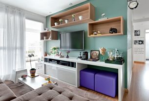
Suvinil’s team of experts created some color combinations from the Pantanal palette. For example, the project above signed by Nicholas Oher and Paloma Bresolin, from OHMA, created for a family of mother and son born in the capital of Mato Grosso.
The colors used highlight the main regional riches: fauna, flora, clay, sun and water.
“Being able to bring colors from this palette into our project was gratifying, as the tones say a lot about the elements of the Pantanal, such as the redder clay, and darker rivers, which lead to a more creative nuance”, details Nicholas.
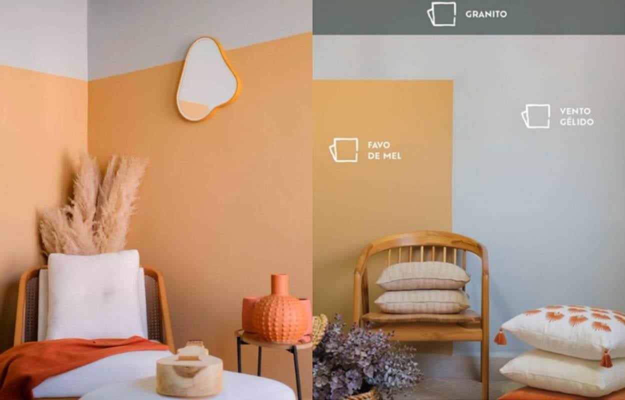
Therefore, the Honeycomb color, being earthy and warm, gained prominence in the project. On the other hand, to create a balanced contrast, the colors Granite and Vento Gélido were used. As a result, they offered comfort and well-being to residents.
However, to arrive at the perfect match, the professionals carefully analyzed the personality of the mother and child.
“The warm colors represent the mother, who asked for a warmer harmony to be created throughout the project, reinforcing the importance of motherhood, while the colder tones, which permeate between light and dark gray, say about her son, Conrado ”, explains Nicholas.
Furthermore, it is important to pay attention to details in the decoration. For example, the mirror that is shaped like a cashew, a typical fruit from the Pantanal. Furthermore, linen and straw and clay objects are also present.
- You may also like Pantone 2022: find out how to use the color of the year in decoration
Conclusion – Pantanal palette
Suvinil’s Pantanal palette is a creation that seeks to explore the colors of different Brazilian biomes. After all, highlighting the country’s wealth is a form of transformation connected to knowledge.
Finally, the colors are available for an unlimited time so that everyone can explore them.
Alane Dias, Davi Brito and Giovanna Lima are in the 18th Paredão! On Sunday, another one of them says goodbye to the house; Which brother do you think will leave the program? Participate in the vote in the Fashion Bubbles poll and check partial results in real time!

Sign up for our newsletter and stay up to date with exclusive news
that can transform your routine!
Warning: Undefined array key "title" in /home/storelat/public_html/wp-content/plugins/link-whisper-premium/templates/frontend/related-posts.php on line 12
Warning: Undefined array key "title_tag" in /home/storelat/public_html/wp-content/plugins/link-whisper-premium/templates/frontend/related-posts.php on line 13