When we talk about neutral tones in decoration, we immediately think of white and its variations. At first, it may even seem monotonous. After all, it’s what we see most in most homes out there. But believe me: neutral tones go far beyond the basics. In fact, they can have an effect as impactful as the more intense ones!
It is no surprise that several decoration trends around the world value these nuances as the main nuances of the color palette. Keep reading to find out what they are — and check out how to use the other shades that are so popular!
How to decorate with neutral tones?
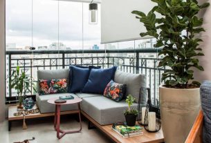
There is no shortage of inspiration for using neutral colors in your decor. After all, even those who love color recognize the value of a good off-white or brown wood to create combinations.
Known for their versatility, they are most often used as a base for bolder compositions. In this case, we go beyond the walls: a smooth, neutral cushion is an infallible partnership among a mix n’ match of prints, for example.
Likewise, a rustic wooden table can make a dining room with wallpaper full of personality a little more harmonious.
See how easy it is? It is as if these colors had a mediating effect, balancing the environments of the house. Therefore, there is no reason to find them monotonous. They are valuable!

However, in these cases, neutral tones are secondary. You can also have them as the main element of your home. The secret? Bet on textures!
Neutral tones in the Scandinavian style
We learn great decoration lessons when looking at northern Europe. In Scandinavian countries, the cold dominates most of the year — along with short days, with very little natural light.
In both, the main colors are white and off-white. On the walls, ceiling, furniture and even the floor, as the wood has a lighter dye there.

This happens because white reflects the colors present in light more intensely, enhancing natural and artificial lighting. The effect is even capable of influencing the feeling of spaciousness of a space. This is an interesting trick for small houses and apartments, you know? A plus for decorating with neutral tones!
But they don’t stop there. After all, pure white can be considered cold. To him, these decor trends combine textures, as we mentioned above. Wooden furniture is a favorite, accompanied by delightful rugs, natural basketry, wool blankets and much more.
Therefore, check out great tips on how to use baskets and boxes to organize environments. In addition to decorating ideas using baskets in different styles. Find out how to choose the best option to use them in your home or business.
Highlighting that Natural Materials are in fashion! See the concept of natural and why it’s back. And there are also lots of photos and inspiring tips to include them in the decoration.

Other neutral tones in decoration
While white is preferred by northern Europeans, we understand that it may not be yours. No need to worry: there are several neutral tones that are just as democratic and beautiful for you to discover and combine. Among them the countless variations of gray, all kinds of wood and beige in many intensities.
Off-white or white: how to differentiate?
Which is which? We will solve this mystery for you! When we talk about white, we mean that pure tone. In color theory, true white is formed by the total absence of color. Off-white is a slightly warmed variation of this common tone. Some even say it’s a slightly “dirty” white, you know?

It leans towards beige, but not enough to be confused. That’s why the English term “off” is used, which in this case indicates separation. It’s a far from white white! It is chosen when we want a clean atmosphere in the decoration, without all the shine that the other color would have.
Below, you can clearly see this difference between the wall and the ceiling in the living room. In this case, the paint color appears darker because of the lighting, but it is closer to off than beige.
Tones of cinza no decor
In recent times, gray has become one of the most popular neutrals for home color. The reason is simple: it is both versatile and modern!
Contrary to what many people think, there are several types of gray — one for every taste. This neutral (and others too) can be part of your decor combined with a series of undertones that completely change the past sensation!
Some grays are cooler, with secondary blue and purplish nuances. They are recommended for composing color palettes for rooms, or spaces where tranquility is a priority.
Others are warmer, with yellow highlights. A good choice for a room in neutral tones, for example: this combination leaves the room with a more welcoming atmosphere, perfect for receiving visitors.

Then we enter another field. The color intensity! Its darker versions usually characterize environments with a strong, powerful personality. To break the darkness, the suggestion is to use this gray on a prominent wall or play with gold accents on the furniture.

Gray on burnt cement walls
Gray is also a favorite for creating textured walls. It is the color most used to create the burnt cement effect — completely renewing the walls of a room.
One of the advantages of opting for this style is that it is great value for money. You can even do the installation yourself, okay? We teach you the complete step-by-step guide to this trend. It’s also full of inspiration for you to bring the effect into your own home!

A heart preta I do not decorate
Anyone who loves impactful decor must have already fallen in love with an environment with black walls. Color is used as a “punch” in the decor — the element that attracts the most, and gives the cue for the use of other pieces.
The effect is even more intense if the entire color palette is based on cooler neutrals, including gray. At the same time, it is possible to create cozy environments with black: throw lighter nuances and a little brown into the mix!

Because it has such a strong effect, black is often used in specific furniture or details. It appears on buffets or cabinets, and even on kitchen walls, as in the example of Subway tiles.
Check out more tips on how to use black in decoration with 58 photos to inspire you.

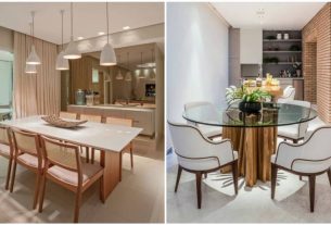
Beige in decoration with neutral tones
Who knew beige would be so popular! The reason for this is that, like gray, you can choose between several different intensities and undertones that best suit your home. Therefore, it is not limited to the most common beige “colored pencil”.
For example, look at this painting option on the staircase of a house: it brings a touch of pink, reminiscent of a more mature version of the color. Used in combination with the white and green of the plants, it is already capable of indicating what the style of those who live in that place is like! What about?

Another name by which we know beige is fendi, a mixture of the color with a little gray. Interestingly, colors like this in English are even called grey — the first syllable comes from the word grey to gray, and the second comes from beigefrom beige.

In short, fendi and other similar colors create elegant environments, with classic appeal. They are also widely used alongside the suede texture — whether on walls or in the furniture upholstery itself. Which type of beige is your favorite?
Brown and terracotta decor
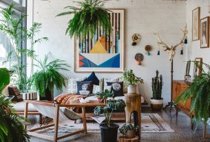
Timeless. This is an undeniable quality of brownish neutral tones. Color will never go out of fashion — at least not when applied in the form of wood to furniture, or to other organic textures such as fibers and straw.
It is precisely this connection with the natural that makes the earthy palette so attractive. Furthermore, it is often used in warm tones. We even talk a lot about wood as an element that warms up the decor! She is a source of comfort.

Here, we have the freedom to be bold with the flooring, furniture and even the cabinets. The universe of paints is not left out, ok? We found beautiful variations of brown to paint details or even entire walls. It can be used in coffee, caramel, terracotta…
Do you want to bring some bossa to these neutral tones? Just as you can use gray in the form of burnt cement, exposed bricks give new air to these palettes that we love so much.

3 Extra Tips for Decorating with Neutral Tones
1. Choose a tone as the main tone
After all, it will be the basis of your decoration and will connect all the decisions you make next. It’s like a clean canvas for you to color on
2. Discover your colorful complementary shade
One of the most popular color palettes at the moment — and almost completely neutral — includes off-white, terracotta, burnt beige and a little green. What about?
Yellow is also often seen lighting up environments that have off and beige as the main tones!

3. Choose where to apply each of these colors
This task seems complex, but it is not. Here, just understand the proportion of colors in the environment! Imagine you have a house with brown, wooden floors. You might choose a warm beige for the walls and ceiling, for example.
Following the palette we suggested in tip 2, the secondary color could be green — which appears on the sofa, the largest piece of furniture in the room. In this case, he is a highlight!
Let’s say you have a favorite painting that you want to put on this sofa, and it’s mustard. Match! What you need to do next to really “connect” the elements is to repeat some of these colors. It can be different intensities — an orange cushion there, a blanket with wool fringes here… and that’s it. A palette of few colors with a beautiful and uncomplicated result.
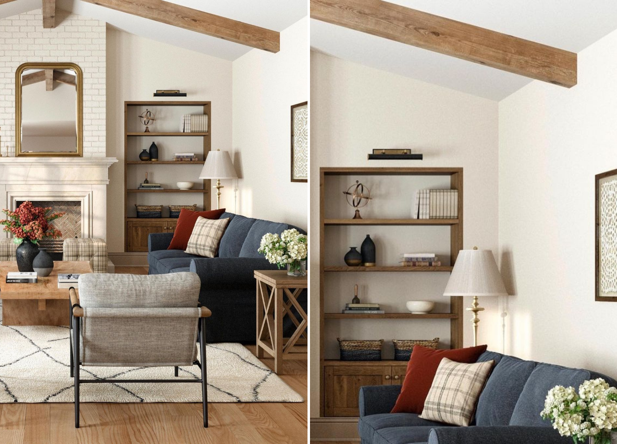
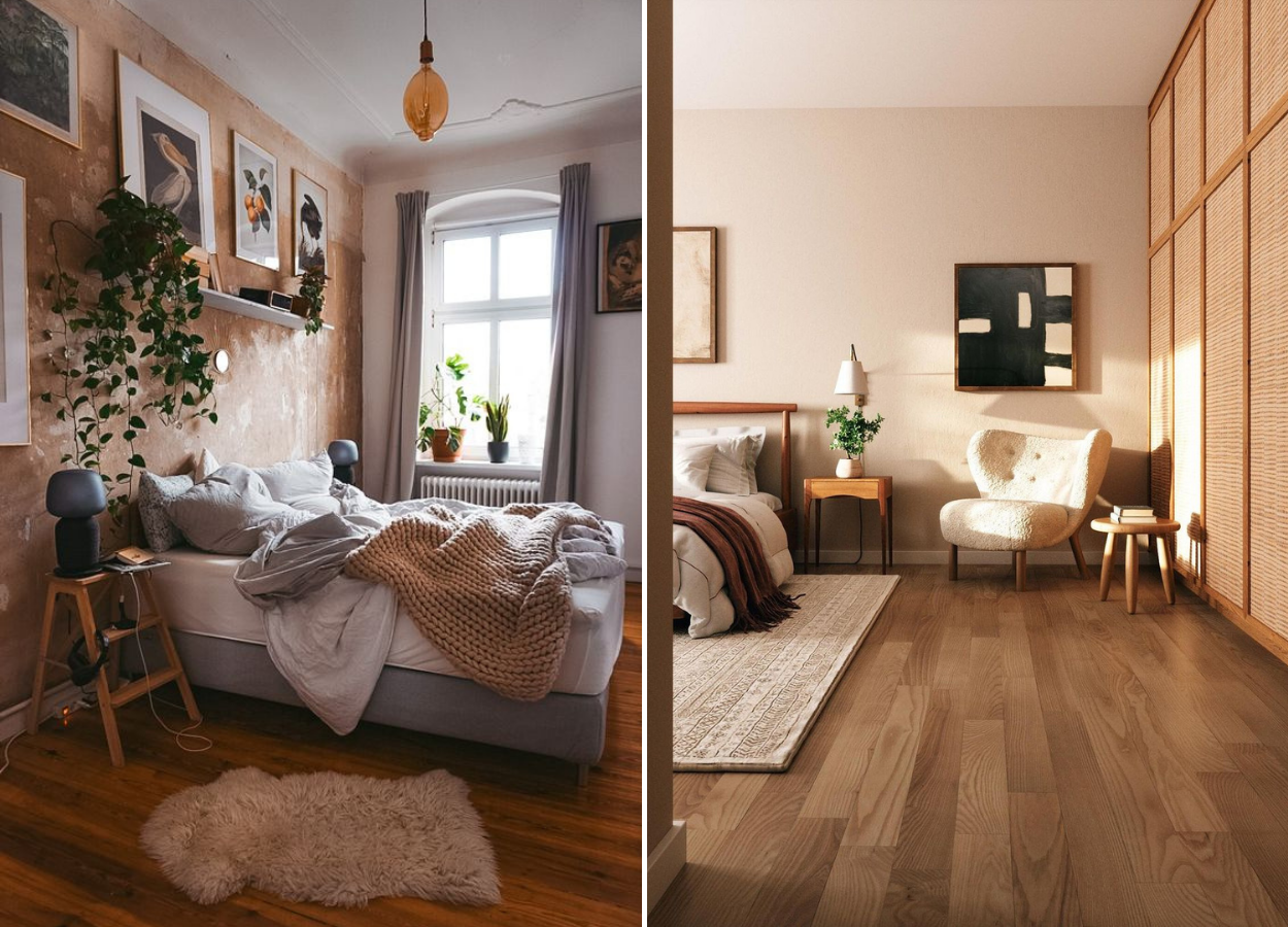
Below, you can check out two decor ideas with similar palettes for inspiration. At the end of the day, coloring your decor is a matter of practice — but it should always be a fun task!

Feeling inspired? You can still check out our list of Instagram profiles to follow and always find incredible references. And, of course, exercise your eye in relation to colors!
Alane Dias, Isabelle Nogueira and Lucas Henrique are on the 19th Paredão! On Tuesday, another one of them says goodbye to the house; Which brother do you think will leave the program? Participate in the vote in the Fashion Bubbles poll and check partial results in real time!

Sign up for our newsletter and stay up to date with exclusive news
that can transform your routine!
Warning: Undefined array key "title" in /home/storelat/public_html/wp-content/plugins/link-whisper-premium/templates/frontend/related-posts.php on line 12
Warning: Undefined array key "title_tag" in /home/storelat/public_html/wp-content/plugins/link-whisper-premium/templates/frontend/related-posts.php on line 13