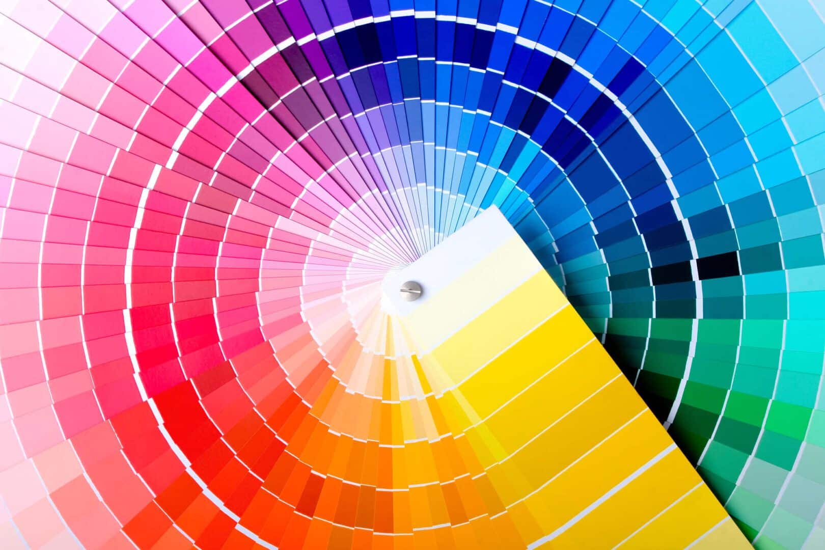
Combining colors is not simple and requires more technique than common sense, hence the importance of the color wheel.
For many people, combining colors – color wheel – can be a very complicated and even complex task. But unlike what many people think, knowing how to combine different colors and tones goes far beyond just having common sense.
In practice, there is a specific technique for doing this. And obviously, this demands a certain basic knowledge of colors and especially the color circle.
Color combination is very important for many things, after all, everything depends on it. It is absolutely everywhere, in fashion, makeup, decoration, art, photography, products, design, etc.
You may have already heard about the power of colors, or how they have a strong influence on our perception of things. Therefore, it is very important to know how to combine colors for whatever purpose.
Anyway, today we will understand better about the color combination technique, get to know the color circle and learn how to create the most beautiful and diverse combinations. All this to further enhance your looks, decoration or whatever your imagination tells you.
Importance of color combination

It may seem futile to some, but the truth is that knowing how to combine colors is very important for everything. Surely you have found yourself in this dilemma at some point in your life: which color goes with which? Whether for a more elaborate look, make-up or even decorating your living room.
Therefore, a lack of knowledge about colors and combinations can result in harmonious combinations or even leave you hostage to the same old tones. And anyone who thinks that this type of knowledge is exclusive to professionals who work with this or artists is mistaken.
Knowing how to combine colors is important for everyone. But of course you don’t need to know everything about it in depth, just know the basics to use in your everyday life.
And to learn this, the starting point is to know the color circle, or chromatic circle, as it is also known. It is through him that all combinations arise.
Understanding the color circle

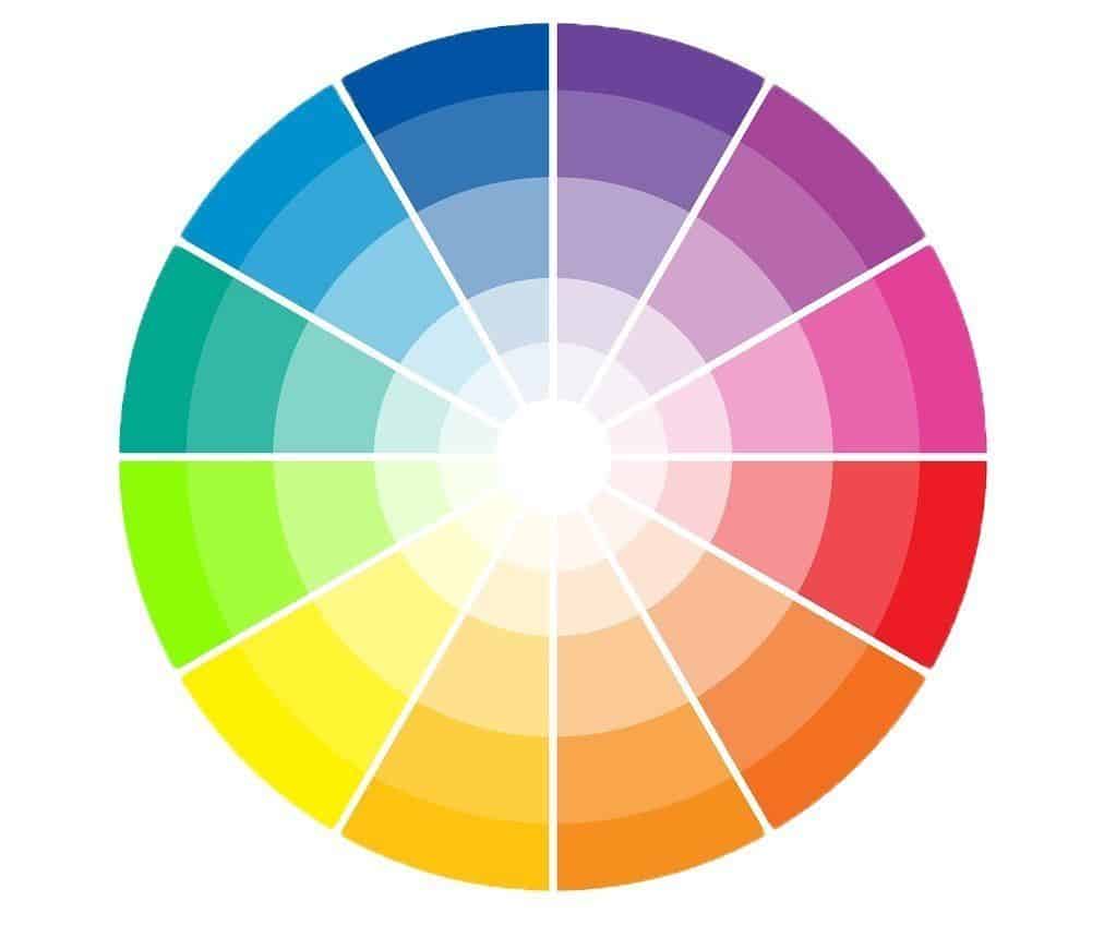
In this circle, we can notice that there are 12 colors with different shades. This is the basis to start learning about color combination. By observing the circle, it is already possible to see which colors present the most pleasant and harmonious combinations.
Within color theory, we have the three primary colors (red, yellow and blue), the three secondary colors that are the mixture between the primaries (green, orange and violet) and six tertiary colors, which are the result of the mixture between the primary and secondary colors.
In this way, every combination is made based on the position of these colors within the circle, the most common being: monochromatic, analogous, complementary and triads. Furthermore, colors also have other properties that contribute to the combination, which in this case are hue, luminosity and saturation.
And finally, you should already know that they are all divided into warm colors and cold colors. The warm colors are red, yellow, orange and pink, which are more eye-catching and cheerful. The cold colors, which are blue, green, and purple tones, are more sober. White, black and gray are considered neutral colors, which makes them simpler to combine.
How to combine colors

So, knowing this, it’s time to learn about the color combination technique, which we mentioned previously.
Monochrome combination

This is one of the simplest combinations to make, as well as being very elegant. As the name suggests, it is a variation of shades of the same color. This is precisely why it is easier to do and generally pleases most people.

In this type of combination, you can add details in neutral colors to diversify without changing the palette too much. Remembering that this applies to several purposes, whether in decoration, choosing clothes, makeup, photographs, etc.
Analogous color combination

A combination of analogous colors consists of combining a primary color with two other “neighboring” colors, that is, colors that are in sequence within the color circle. In this case, one of the colors must prevail in the combination, while the other two play the role of supporting characters, enhancing the overall composition. It is a very common mixture in nature, which brings a greater feeling of harmony and naturalness.

However, you need to be careful when making similar color combinations and not overuse colors. Two maximum three colors are enough. Just like monochromatic, this combination is also simpler to make and does not have contrasting colors. An important tip is: try not to mix warm and cold colors in the same composition.
Complementary combination

The complementary combination is a little bolder and mixes two colors that are opposite each other on the color wheel and that present greater contrast between each other. So, in this case it is okay to combine cold colors with warm colors. This mixture even provides creative and eye-catching combinations, being widely used in outfit compositions, a very lively and energetic bet.

Therefore, as it attracts a lot of attention, the tip is to choose just one of the colors to highlight the composition. This way, we will have a dominant color and other complementary colors, ideal for highlighting details. However, unlike monochromatic and analogous compositions, finding a balance in the complementary combination is a little more difficult. Just be careful not to choose very vibrant colors, as they can overshadow each other. As in the image above, the predominant color is blue, but the yellow of the chair and cushion contrasts well in the complete picture.
Triad combination

A mixture of three colors with the same distance from each other within the color circle is called a triad combination. Therefore, the chosen colors must form an equilateral triangle within the color circle. In this way, the combination of these colors forms a modern, bold and contrasting triad, while maintaining balance between the colors.

Therefore, the secret to harmonizing this combination is to choose one of the colors to be the highlight, and the other two to contrast in the details. Unlike other combinations, the triad is certainly the most informal and cool. It works very well in decorating environments with a light and fun feel and in creative and eye-catching proposals.
Tips for combining individual colors

So, now that you know more about the color circle and combination techniques, you are ready to create the most varied compositions, from look, makeup, decoration, etc. And to help you even more with this, check out the following tips for combining individual colors:
- Branco: As it is a neutral color, white is very versatile when it comes to combinations and goes with literally everything, especially black, red and blue.
- Longing: beige in turn contrasts well with blue, brown, emerald green, black, white and red.
- Gray: another tone within the neutral palette, it combines very well with violet, pink, blue and red tones.
- Pink: goes well with brown, white, mint and olive green, turquoise and light blue.
- Red: a very vivid warm color that goes well with yellow, green, blue, black and white.
- Brown: a palette with shades of cream, pink, beige and green works well in compositions with brown.
- Orange: contrasts greatly with lilac, violet, blue, white and black tones.
- Yellow: It is a warm color that combines very well with blue, violet, lilac, gray and black.
- Verde: combines with orange, brown, yellow, cream, gray, black and white.
- Lilac: works great with orange, pink, violet, yellow and white tones.
- For that: the universal color, combines with all existing colors, highlighting orange, green, red, yellow and white tones.
Anyway, what did you think of this article? In fact, take the opportunity to also check out Pantone – What it is and the history of the brand that standardized the colors.
Sources: Blog Edu K Etiqueta Única Jornal Cruzeiro
Images: Ariana Nasi Arquitetura Simone Pedreschi Architecting Styles Pinterest Understand First A Revista da Mulher Versar Tinto Max Denim Zero Insider

Sign up for our newsletter and stay up to date with exclusive news
that can transform your routine!
Warning: Undefined array key "title" in /home/storelat/public_html/wp-content/plugins/link-whisper-premium/templates/frontend/related-posts.php on line 12
Warning: Undefined array key "title_tag" in /home/storelat/public_html/wp-content/plugins/link-whisper-premium/templates/frontend/related-posts.php on line 13


