
When you think of a color that inspires presence, courage and that inspires creativity, what is it? According to Pantone 2022 it is blue-violet!
Technically called Very Peri, next year’s color promises to be a trend. But do you know how to use it in decoration?
As it is a striking color, you need to know the best way to place it at home in order to create a harmonious environment without looking boring. So, keep reading and check out the main tips.
What color for 2022?
If you are thinking about building, renovating or redecorating a space, take note of this tip: Very Peri is Pantone’s 2022 trend color.
“Displaying a carefree confidence and bold curiosity that animates our creative spirit, the curious and intriguing PANTONE 17-3938 Very Peri helps us embrace this altered landscape of possibilities, opening us to new vision as we rewrite our lives,” explains the brand.
The objective was to highlight the gratitude transmitted by the blue tone integrated with a future perspective based on a new light reflected from violet.
Therefore, in the transition the world is going through in the face of the coronavirus pandemic and social isolation, it is important to highlight that the physical and virtual worlds have been integrated in new ways.
“Digital design helps us stretch the limits of reality, opening the doors to a dynamic virtual world where we can explore and create new possibilities. With trends in gaming, the growing popularity of the metaverse, and the growing artistic community in the digital space PANTONE 17-3938 Very Peri illustrates the fusion of modern life and how color trends in the digital world are manifesting in the physical world and vice versa ”, he adds.
See what the color representation is:

What is Pantone 2022?
First of all, you need to know what the Pantone Color Institute. Basically, it is a business institution that belongs to Pantone.
This “department” is responsible for highlighting seasonal colors that will be trending. Therefore, the color of the year predicts what the world expects for clothes, products and visual identity.
How is the color of the year chosen?
The Pantone 2022 color of the year is chosen based on a psychological analysis and color consultancy.
“To arrive at the selection each year, Pantone color experts at the Panto Color Institute scour the world for new color influences. This can include the entertainment industry and films in production, traveling art collections and new artists, fashion, all areas of design, popular travel destinations, as well as new lifestyles, entertainment styles and socioeconomic status,” he explains. .
In addition, the team also evaluates the technology landscape, textures, materials, social media, sporting events, among others.
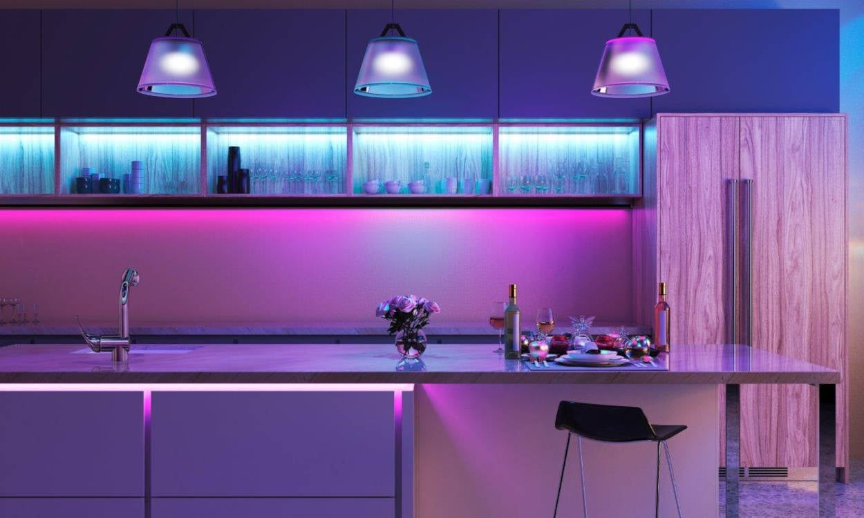
How to use the Pantone 2022 color in decoration?
The blue-violet is extremely striking. Therefore, you need to be careful when using it. Basically, the best way to add it to your decor is to focus on details.
For example, a piece of furniture, an accent wall and even the ceiling in the room. In addition to adding personality to the space, Very Peri also symbolizes modernity. Therefore, it is perfect for industrial or minimalist style decorations.
On the other hand, for those who prefer a colorful space, it is possible to play with mixing different tones. This way, the room becomes less boring and more relaxed.
Want one more tip? Because it is linked to technology and modernity, the color is perfect when associated with geometric shapes. For example, a geometric wall, an object in a striking shape or even when used to highlight an artistic piece.


Alane Dias, Isabelle Nogueira and Lucas Henrique are on the 19th Paredão! On Tuesday, another one of them says goodbye to the house; Which brother do you think will leave the program? Participate in the vote in the Fashion Bubbles poll and check partial results in real time!