As I embarked on my journey to transform my living space, I quickly realized that one of the most significant aspects of interior decorating revolves around color selection. The colors we choose not only influence the aesthetic of our homes but also impact our mood and overall well-being. In this article, I’ll take you through the most popular colors for interior decorating, offering insights that helped me along the way, so you can discover, choose, and transform your own space.
Understanding the Psychology of Color
Before diving into specific colors, it’s essential to understand the psychology behind them. Colors evoke emotions and can significantly affect how we perceive and interact with our environments. For example:
- Blue: Often associated with calmness and serenity, blue can create a peaceful atmosphere in bedrooms or bathrooms.
- Yellow: This cheerful color is linked to happiness and positivity, making it ideal for kitchens and dining areas.
- Red: A color of passion and energy, red can invigorate spaces like living rooms or home gyms.
- Green: Symbolizing nature, green promotes tranquility and balance, perfect for any room where relaxation is key.
- Purple: Associated with luxury and creativity, purple can add a touch of elegance to any space.
Understanding these associations can guide your choices as you select colors for your home.
The Most Popular Interior Colors of 2023
Trends in interior color change from year to year, influenced by various factors including fashion, technology, and even social movements. In 2023, several colors have emerged as frontrunners in interior design:
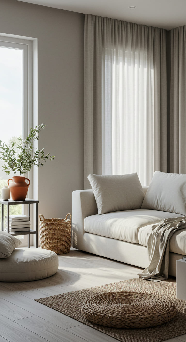
1. Soft Neutrals
Soft neutrals, like beige, taupe, and cream, have gained popularity for their versatility and timeless appeal. They serve as the perfect backdrop for any décor style, allowing furniture and accessories to shine. I found that painting my living room in a soft neutral created a calming environment that complements my eclectic furniture collection.
2. Earthy Tones
Earthy colors such as terracotta, olive green, and warm browns are trending as they bring a sense of nature indoors. These hues create a cozy atmosphere, making spaces feel inviting. I used an earthy palette in my dining area, incorporating terracotta accents that harmonized with my wooden table, offering a rustic yet modern feel.
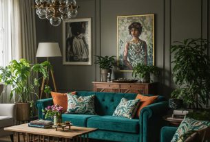
3. Bold Jewel Tones
Vibrant jewel tones like sapphire blue, emerald green, and ruby red have made a comeback, adding richness and depth to interiors. These colors work exceptionally well as accent walls or in statement furniture pieces. I opted for a deep emerald green sofa in my living room, which became the focal point of the space and sparked numerous compliments from guests.
4. Pastels
Pastels are not just for spring anymore! Soft pinks, lavenders, and baby blues have emerged as popular choices for creating a light and airy feel. They are especially effective in smaller spaces, making them feel larger and more open. I painted my home office in a pastel blue, which instantly brightened the room and encouraged creativity during my work hours.
5. Black and White Contrast
The classic black and white combination remains a favorite for those seeking a modern and sophisticated look. This high-contrast palette can be used in various styles, from minimalist to industrial. I utilized black accents in my kitchen, pairing them with white cabinetry for a striking, contemporary aesthetic.
Choosing the Right Color for Your Space
Now that we’ve explored popular colors, the question remains: how do you choose the right one for your space? Here are some tips that worked for me:
1. Consider Your Space
The size and lighting of your space can significantly impact how colors appear. Lighter colors can make small rooms feel more expansive, while darker hues can add warmth and coziness to larger areas. I learned that my north-facing living room required warmer tones to counteract the cool light it received, leading me to soft beige walls paired with warm wooden accents.
2. Test Before You Commit
Always test paint colors on your walls before making a final decision. Paint samples and swatches can look different in various lighting conditions. I spent a weekend painting swatches in different areas of my living room to see how the colors changed throughout the day. This step was crucial in helping me choose the perfect shade.
3. Consider Your Existing Décor
Your furniture and décor should harmonize with the colors you choose. Use a color wheel to find complementary or analogous colors that work well together. I found that my bold, patterned rugs influenced my wall color choices, leading me to select a neutral base that allowed the patterns to pop.
4. Set the Mood
Think about the atmosphere you want to create in each room. For calming spaces like bedrooms, opt for softer, cooler colors. In contrast, for energetic spaces like home gyms, bolder colors might be more appropriate. I aimed for tranquility in my bedroom by using a soft lavender, which promotes relaxation and restful sleep.
Case Studies: Successful Color Transformations
To illustrate the transformative power of color, let’s look at a few case studies that inspired me:
Case Study 1: The Cozy Cottage
A couple decided to redecorate their small cottage, which felt dark and cramped. They painted the walls a soft dove gray and added white trim, instantly brightening the space. They complemented the neutral base with vibrant green plants and colorful accessories, which brought life into the home. This change not only made the cottage feel larger but also more inviting.
Case Study 2: The Modern Loft
A young professional living in a city loft wanted to create a chic and stylish environment. She chose a deep navy blue for one feature wall, paired with crisp white walls throughout the rest of the space. The bold accent wall added sophistication, while the white kept the area feeling open. Minimalist furniture in metallic tones completed the look, showcasing the power of color contrast.
Case Study 3: The Family Home
A family with children wanted their home to be fun and energetic. They painted the playroom in a bright yellow and added colorful wall decals. The living areas featured soft greens and blues to balance the vibrant playroom. This thoughtful color scheme created a harmonious flow while allowing the playroom to remain a lively, stimulating space.
Color Trends to Watch for in the Future
As we look ahead, certain color trends are emerging that are likely to shape interior design for years to come:
- Biophilic Design: This trend focuses on incorporating nature into our living spaces, with colors inspired by the outdoors—think soft greens, earthy browns, and sky blues.
- Warm Whites: Instead of stark whites, warm whites with creamy undertones are becoming preferred choices, creating a cozy and inviting atmosphere.
- Moody Hues: Darker shades like charcoal, navy, and forest green are gaining popularity for their dramatic impact and ability to create intimate spaces.
- Color Blocking: This bold technique mixes contrasting colors within a single room, allowing for dynamic and personalized designs.
Staying ahead of these trends can keep your home looking fresh and stylish.
Frequently Asked Questions (FAQs)
1. How do I know which color suits my space best?
Consider the size, lighting, and purpose of the room. Testing paint samples in different lighting conditions will help you determine the right shade.
2. Can I mix different colors in one room?
Absolutely! Mixing colors can add depth and interest to your space. Use a color wheel to find complementary colors that work well together.
3. What if I choose a color I don’t like after it’s painted?
Choosing paint is a big commitment. If you’re unsure, start with an accent wall or smaller area. You can always repaint if you’re not satisfied.
4. Are there any colors I should avoid in certain rooms?
Generally, avoid overly bright colors in bedrooms, as they can be stimulating. Likewise, dark colors in small spaces can make them feel more cramped.
Conclusion: Transform Your Space with Color
Choosing the right colors for your interior space can seem daunting, but it doesn’t have to be. By understanding the psychology of color, exploring current trends, and considering your unique space, you can create a harmonious environment that reflects your personality and enhances your well-being. Whether you opt for soft neutrals, bold jewel tones, or earthy shades, remember that color has the power to transform your home into a sanctuary.
Are you ready to embark on your color transformation journey? I encourage you to take the insights shared in this article and apply them to your own space. Don’t forget to sign up for our newsletter to stay updated on the latest trends and tips, and share this article with friends and on social media to inspire others in their decorating endeavors!

Mini Funny Turtle Valentines Day Gifts for Him Her, Wife Husband Girlfriend Boyfriend I Love You Gift, Couples Anniversary Birthday Gifts Ideas for Men Women, Crochet Turtle Valentines Decorations
$9.99 (as of 01/02/2026 04:42 GMT -03:00 - More infoProduct prices and availability are accurate as of the date/time indicated and are subject to change. Any price and availability information displayed on [relevant Amazon Site(s), as applicable] at the time of purchase will apply to the purchase of this product.)
Sign up for our newsletter and stay up to date with exclusive news
that can transform your routine!