As I navigated the world of interior design, I often found myself wondering about the impact of color in my living space. How many colors should I use? Would they clash or harmonize? After extensive research and personal experimentation, I’ve come to realize that color is not just a visual element; it profoundly influences our emotions, behaviors, and overall well-being. In this article, I will share my insights on how to effectively use color in interior design, provide tips to elevate your space, and encourage you to share your own palettes!
The Psychology of Color in Interior Design
Color psychology plays a crucial role in how we perceive our environments. Each hue evokes different feelings, and understanding these can help us create spaces that resonate with our personalities and moods.
- Red: Often associated with passion and energy, red can invigorate a space, making it perfect for dining rooms or home gyms.
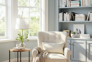
- Blue: Calming and serene, blue works wonders in bedrooms or bathrooms, promoting relaxation and tranquility.
- Yellow: Bright and cheerful, yellow can stimulate creativity and happiness, ideal for kitchens or playrooms.
- Green: Symbolizing nature and renewal, green is versatile and can be used in almost any room to create a refreshing atmosphere.
- Purple: Often linked to luxury and sophistication, purple can add depth to a living room or office space.
- Neutrals: Whites, grays, and beiges provide a calming backdrop, allowing other colors to pop while maintaining a balance in the design.
By understanding the psychological effects of these colors, I was able to make informed decisions about the hues I wanted to incorporate into my own home.
Finding Your Color Palette
Choosing a color palette can be an overwhelming task. However, I discovered that a few strategic approaches can simplify this process significantly. Here are some tips that helped me define my color palette:
1. Start with Inspiration
Inspiration can come from various sources. I often found myself looking at nature, art, or even my favorite clothing. Websites like Pinterest and design blogs are treasure troves of color combinations and styles. I recommend creating a mood board to visualize your ideas. Collect images that resonate with you and identify common colors.
2. Limit Your Palette
Too many colors can create a chaotic atmosphere. I found that sticking to a palette of three to five colors provides a cohesive look. This doesn’t mean you can’t use variations of those colors; instead, focus on shades and tints to add depth while maintaining harmony.
3. Consider the Room’s Purpose
Each room serves a different function, and I learned that colors should reflect that purpose. For example, a home office might benefit from stimulating colors like green or blue to enhance productivity, while a bedroom might lean towards softer, relaxing shades.
4. Use the 60-30-10 Rule
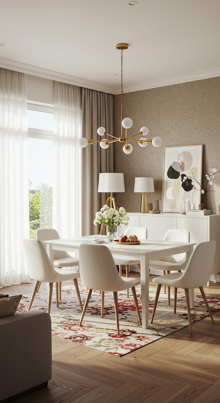
This classic design rule suggests that 60% of a room should be a dominant color, 30% a secondary color, and 10% an accent color. I applied this rule in my living room by painting the walls a soft gray (60%), selecting a navy sofa (30%), and adding vibrant yellow cushions (10%). This balance brought the room to life without overwhelming it.
5. Test Before You Commit
Color can look different depending on the lighting and surrounding elements. I recommend painting small sections of your wall with your chosen colors and observing them at different times of the day. This simple step can save you from costly mistakes.
Creating a Cohesive Look
Once I had my palette established, the next step was to ensure a cohesive look throughout my home. Here are some strategies I implemented:
1. Flow Between Rooms
To create a sense of unity, I made sure that the colors I chose complemented each other across different spaces. For instance, if I used a soft green in the kitchen, I incorporated similar shades in the adjoining dining room and living room, creating a visual flow.
2. Accent Walls
Accent walls can add drama and interest without overwhelming a space. I painted one wall in my dining area a rich charcoal gray, which provided a stunning backdrop for my artwork while allowing the other walls to remain neutral.
3. Incorporate Textures
Texture adds depth to color. I learned that mixing textures—such as smooth fabrics, rough wood, and shiny metals—can enhance the visual appeal of the colors in your space. For example, pairing a velvet sofa with a wicker chair creates an inviting contrast.
4. Layering Colors
Layering isn’t just for clothing; it’s also effective in interior design. I found that using varying shades of the same color family can create a rich, sophisticated look. For example, I used multiple shades of blue in my bedroom, from light sky blue curtains to darker navy accents.
Case Studies: Successful Color Palettes
To further illustrate the power of color in interior design, let me share some successful case studies that inspired me:
1. The Minimalist Approach
A friend of mine opted for a minimalist design in her apartment, using a monochromatic palette of whites and grays. She added interest with various textures—soft throws, sleek furniture, and metallic accents. The result was a calming yet stylish space that felt open and inviting.
2. The Eclectic Mix
Another friend embraced an eclectic style, using a bold combination of colors—rich reds, deep blues, and vibrant yellows. She balanced these bold choices with neutral furniture, allowing the colors to pop without overwhelming the space. It was a lively, energetic atmosphere that reflected her personality perfectly.
3. Nature-Inspired Harmony
A local café I frequented used earthy tones—soft greens, browns, and creams—to create a cozy, inviting environment. They incorporated plants and natural materials, enhancing the connection to nature and promoting a sense of well-being among patrons.
Statistics on the Impact of Color
Research supports the significant impact of color on our emotions and behavior. Here are some fascinating statistics I came across:
- A study by the Institute for Color Research found that up to 90% of snap judgments about products can be based on color alone.
- According to a survey by the Color Marketing Group, 93% of consumers make purchasing decisions based on visual appearance, including color.
- Research published in the journal “Frontiers in Psychology” indicated that color can affect mood and even productivity levels, with blue and green being linked to enhanced focus and creativity.
These statistics further emphasize the importance of thoughtful color choices in our interiors. Investing in a well-considered color palette can significantly enhance not only the aesthetic of a space but also the overall experience of those who inhabit it.
Tips for a Colorful Home on a Budget
Transforming your space doesn’t have to break the bank. Here are some budget-friendly tips I found useful during my own redesign:
1. Paint is Your Best Friend
One of the most cost-effective ways to change the vibe of a room is through paint. A fresh coat can dramatically alter the atmosphere, and it’s relatively easy to do yourself.
2. Rearrange Existing Furniture
Sometimes, a simple rearrangement can give a room a fresh look. Play with the layout of your furniture to create new focal points and enhance your color scheme.
3. Thrift and Upcycle
I discovered that thrift shops and garage sales can be goldmines for unique decor items. You can easily find pieces to repaint or reupholster, allowing you to incorporate your colors without spending a fortune.
4. DIY Decor
Get creative with DIY projects. Whether it’s creating wall art, throw pillows, or even painted furniture, these personal touches can add character and incorporate your color palette seamlessly.
Frequently Asked Questions (FAQ)
How many colors should I use in my interior design?
While there’s no strict rule, a palette of three to five colors typically creates a harmonious look. You can use variations of these colors to add depth and interest.
What are the best colors for small spaces?
Light colors, such as whites, creams, and soft pastels, can make small spaces feel larger and more open. Incorporating mirrors can also help reflect light and enhance the feeling of space.
Can I mix different color palettes in one home?
Yes! Mixing palettes can create a dynamic and personalized environment. Just ensure that the colors complement each other and maintain a cohesive flow throughout the home.
How can I change the mood of a room with color?
Use colors that evoke the desired emotions. For example, to create a calming space, consider blues and greens, while bright yellows and reds can energize and inspire creativity.
If you found this article helpful, I encourage you to sign up for our newsletter for more interior design tips and tricks. Don’t forget to share this with your friends and on social media!
Conclusion
Color is a powerful tool in interior design, capable of transforming a space and influencing our emotions. By thoughtfully selecting a color palette, using strategic techniques, and drawing inspiration from successful case studies, we can elevate our interiors to reflect our personalities and enhance our well-being. Remember that the journey of color exploration is personal and should resonate with who you are. I hope this article inspires you to embrace color in your design journey!
Voircoloria Baby Boxes with Letters, 4 Transparent Balloon for Gender Reveal Birthday Wedding Baby Shower Decorations (White)
$8.99 (as of 01/02/2026 04:42 GMT -03:00 - More infoProduct prices and availability are accurate as of the date/time indicated and are subject to change. Any price and availability information displayed on [relevant Amazon Site(s), as applicable] at the time of purchase will apply to the purchase of this product.)
Sign up for our newsletter and stay up to date with exclusive news
that can transform your routine!