Understanding Color Palette
A color palette is a curated selection of colors that work harmoniously together, often used in design and decoration. It serves as a visual guide, helping to create a cohesive look in various projects, from interior design to graphic design. By understanding the principles behind color palettes, you can enhance the aesthetic appeal of your space or artwork, ensuring that colors complement rather than clash.
The Importance of Color Theory
Color theory is foundational to creating effective color palettes. It encompasses the study of how colors interact, the emotional responses they evoke, and their psychological effects. By applying color theory, designers can select colors that not only look good together but also convey the desired mood or message. For instance, warm colors like reds and yellows can create a sense of energy, while cool colors like blues and greens tend to evoke calmness.
Types of Color Palettes
There are several types of color palettes, each serving different purposes. Monochromatic palettes use variations of a single color, creating a subtle and sophisticated look. Analogous palettes consist of colors that are next to each other on the color wheel, offering a harmonious blend. Complementary palettes, on the other hand, use colors opposite each other on the wheel, providing a striking contrast that can energize a space.
Creating a Color Palette
To create a color palette, start by selecting a dominant color that reflects the mood you want to achieve. From there, choose secondary colors that complement or contrast with the dominant hue. It’s essential to consider the balance of colors; a well-balanced palette will have a mix of light, medium, and dark shades. Tools like color wheel apps and online palette generators can assist in visualizing your choices.
Using Color Palettes in Interior Design
In interior design, a well-chosen color palette can transform a room. It sets the tone and can make spaces feel larger or cozier. When selecting a palette for a room, consider the natural light, the size of the space, and the existing furnishings. A cohesive color scheme can tie together different elements, creating a unified look that enhances the overall design.
Color Palettes for Outdoor Spaces
Outdoor spaces also benefit from thoughtfully chosen color palettes. When designing a garden or patio, consider the colors of plants, flowers, and outdoor furniture. A vibrant palette can create a lively atmosphere, while softer tones can promote relaxation. Additionally, the surrounding environment should influence your choices; colors that blend with nature can create a serene outdoor retreat.
Seasonal Color Palettes
Seasonal color palettes can bring freshness and relevance to your designs. For instance, spring often calls for pastel colors, while autumn may inspire deeper, warmer tones. By aligning your color choices with the seasons, you can create spaces that feel timely and inviting. This approach is particularly effective in home decor, where seasonal changes can be reflected through color.
Color Palettes in Branding
In branding, a color palette is crucial for establishing identity and recognition. Brands often choose colors that resonate with their target audience and reflect their values. For example, green is commonly associated with eco-friendliness, while blue can convey trust and reliability. A consistent color palette across marketing materials helps reinforce brand identity and fosters customer loyalty.
Trends in Color Palettes
Color palette trends evolve over time, influenced by cultural shifts, fashion, and design movements. Staying updated on these trends can inspire your own projects and keep your designs relevant. For instance, the rise of minimalism has led to a preference for neutral palettes, while bold, saturated colors are making a comeback in various design fields.
Testing Your Color Palette
Before finalizing a color palette, it’s wise to test it in the intended space or medium. Paint samples on walls, use fabric swatches, or create digital mockups to see how colors interact in different lighting conditions. This step ensures that your chosen palette achieves the desired effect and allows for adjustments before committing to a final design.
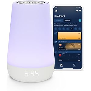
Hatch Rest Baby Sound Machine, Night Light | 2nd Gen | Registry Essential, Sleep Trainer, Routine Builder, Time-to-Rise Alarm Clock, White Noise Soother, Nursery Stories, Toddler Kids Bedroom (Wi-Fi)
$59.99 (as of 27/03/2025 01:22 GMT -03:00 - More infoProduct prices and availability are accurate as of the date/time indicated and are subject to change. Any price and availability information displayed on [relevant Amazon Site(s), as applicable] at the time of purchase will apply to the purchase of this product.)